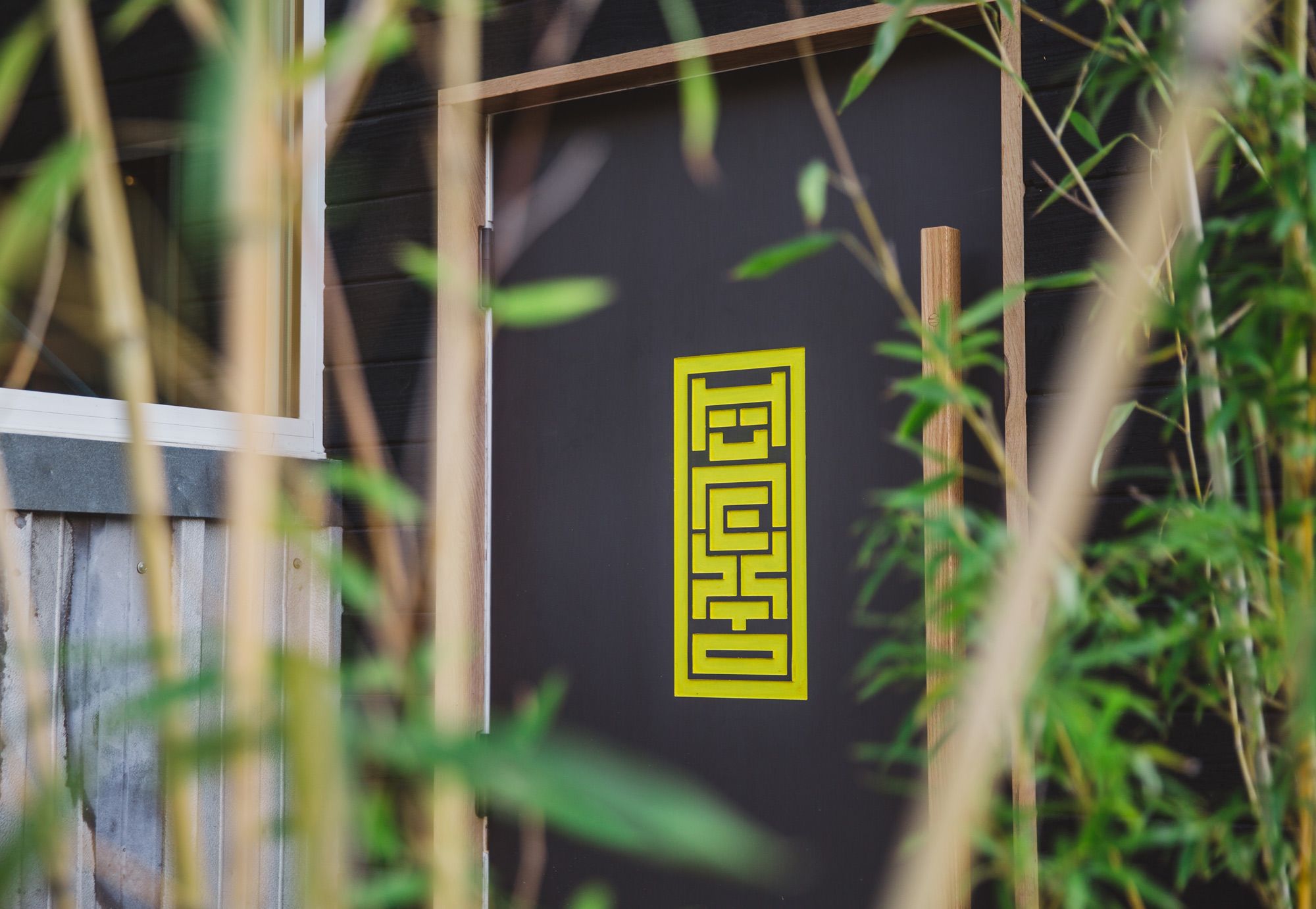
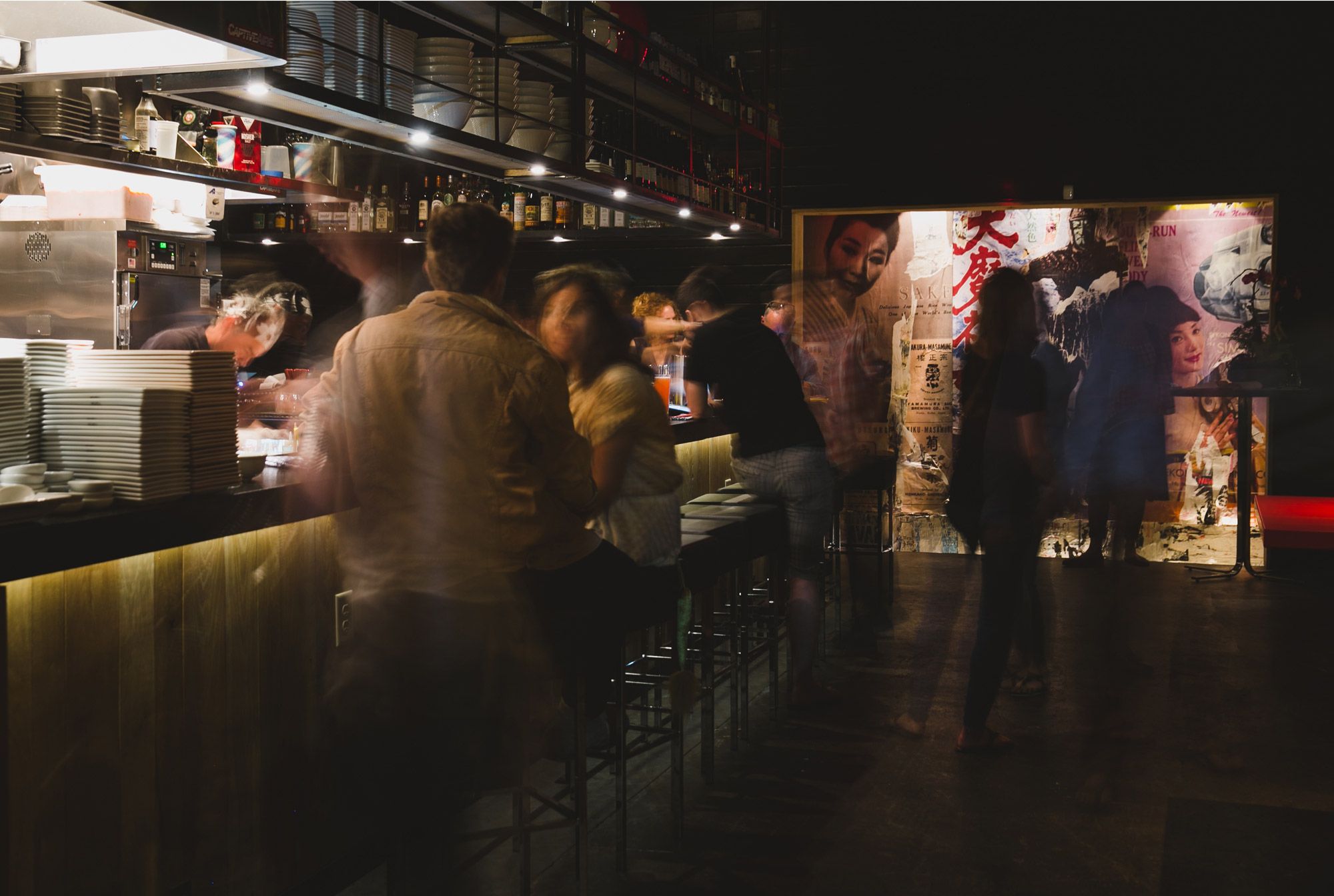
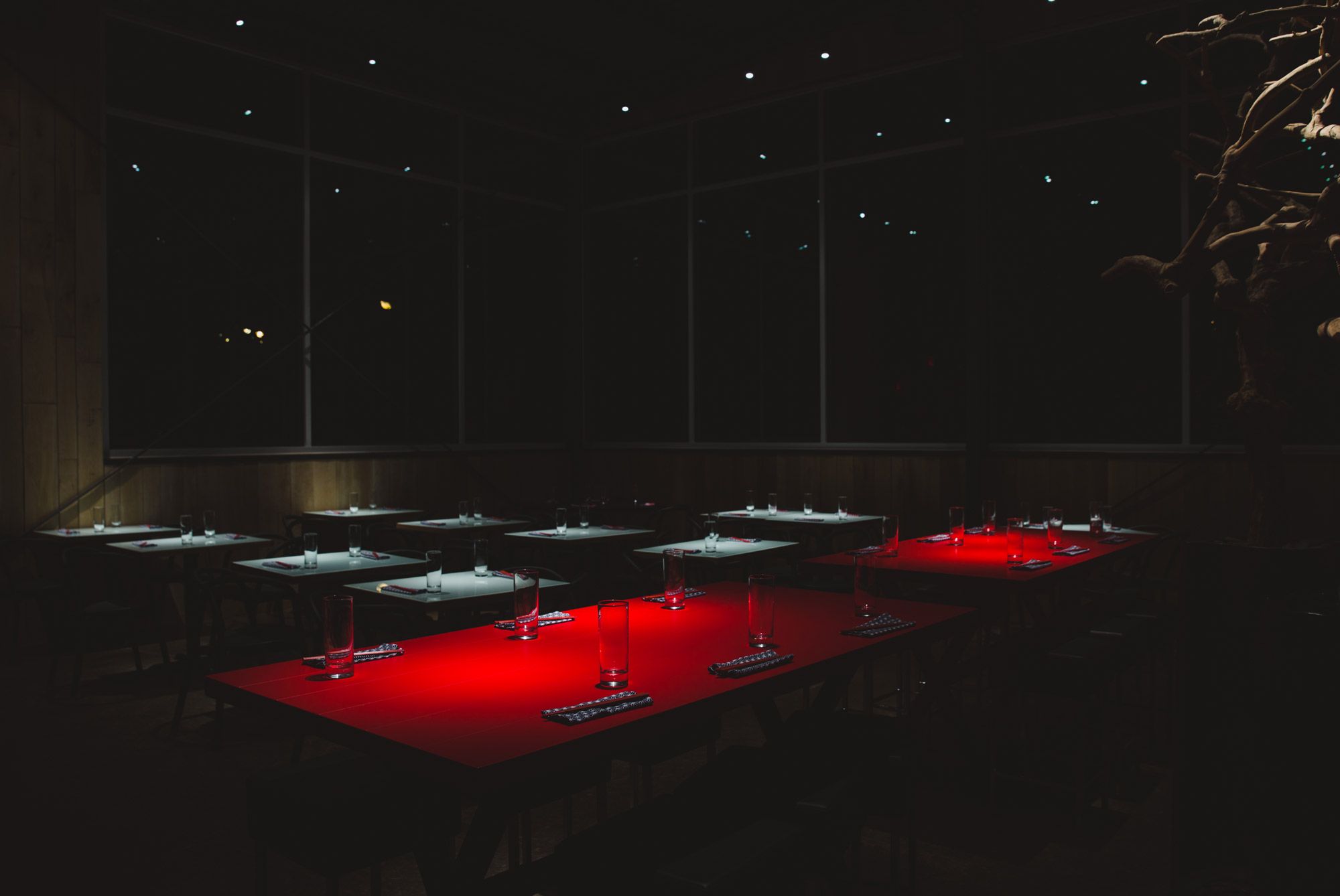
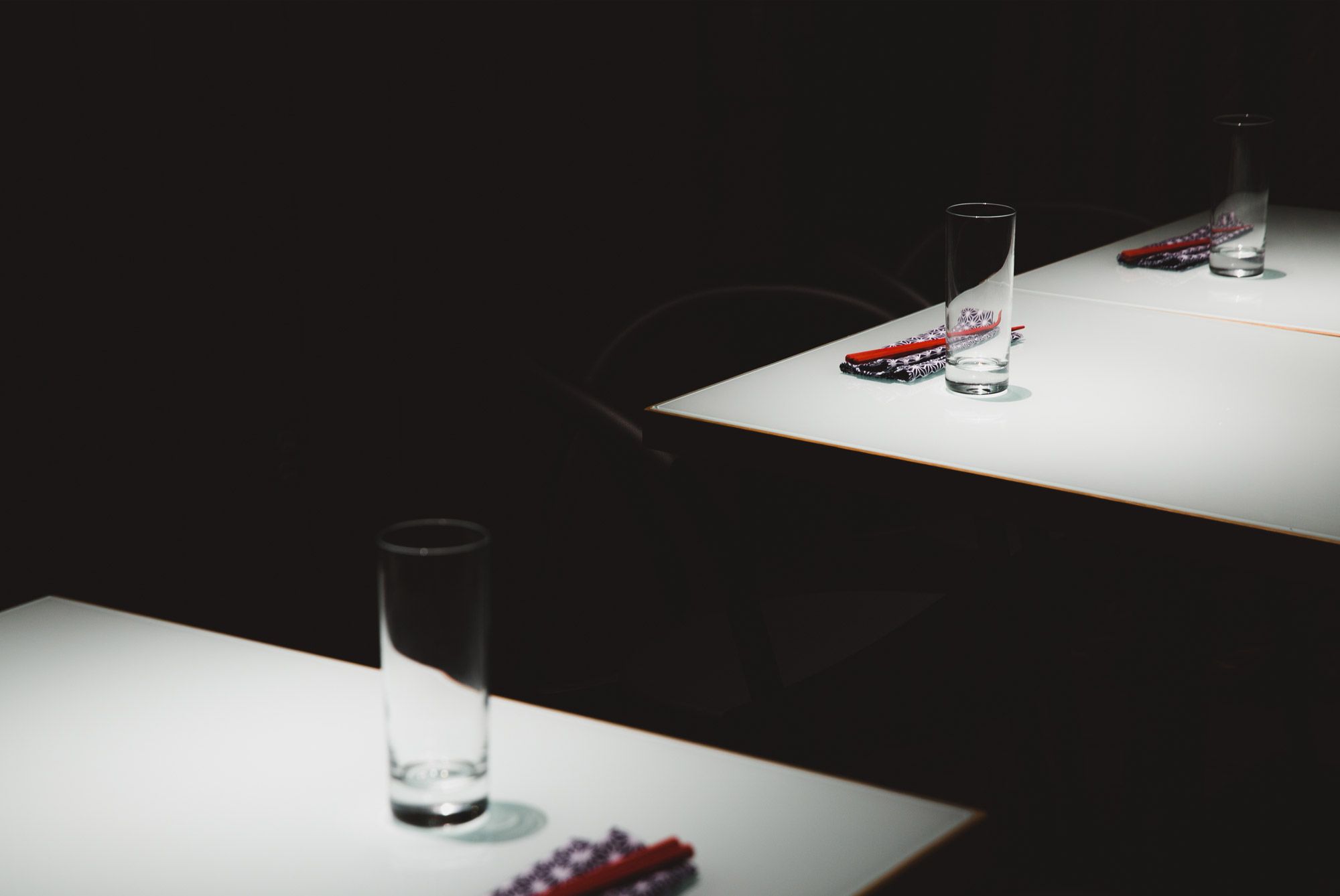
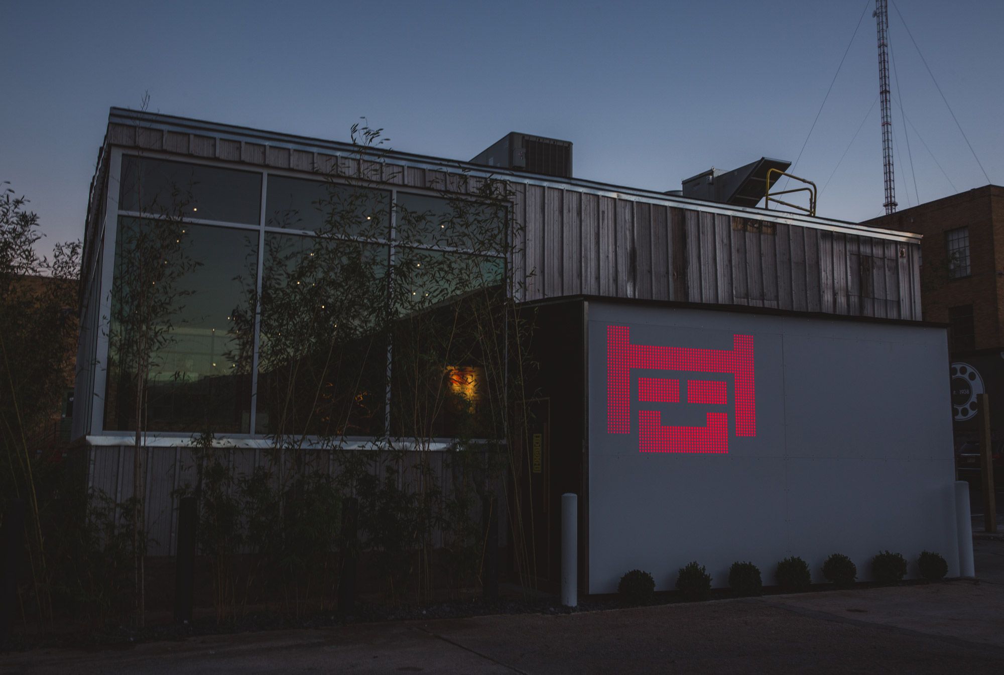
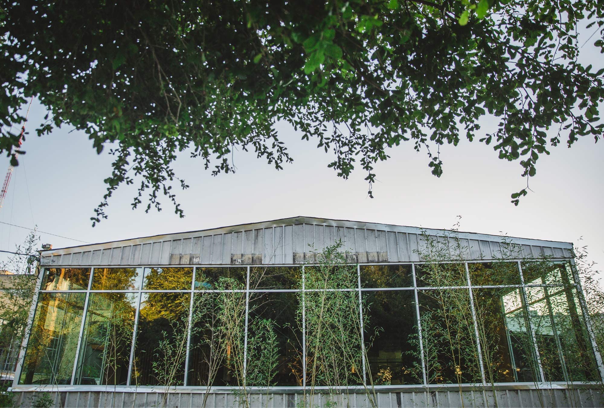
LOCATED IN A CORRUGATED METAL SHED, IN A PARKING LOT, IN ATLANTA, GA, this very serious ramen restaurant knows what it means to eat well, considering its tagline is “SLURP!”. People will ask what does “Nexto” mean. The answer is quite simple: “It means the ramen, robatayaki restaurant located NEXT-TO-TWO.” As in TWO Urban Licks, its big brother restaurant that it shares an industrial warehouse complex with. We conceived both the name as well as the branding for Nexto. It happens to be housed in a very unassuming but sexy industrial metal shed. We loved the idea of exploring a robot theme which plays nicely into Japanese pop-culture. But, this is something that has been done quite a lot so to do it in a new way was the real challenge.
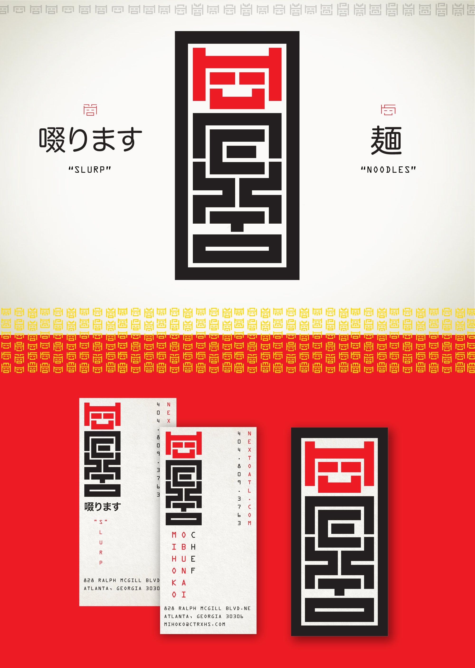
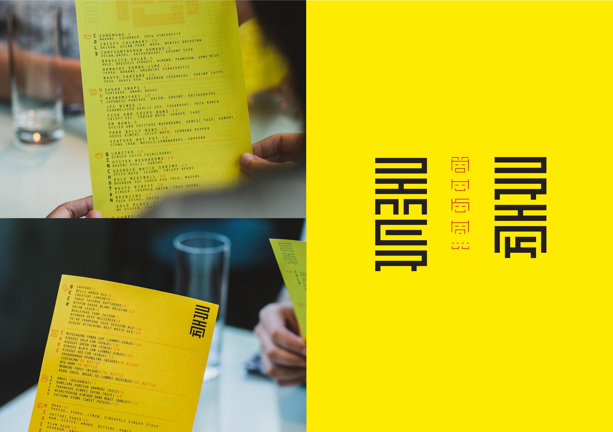
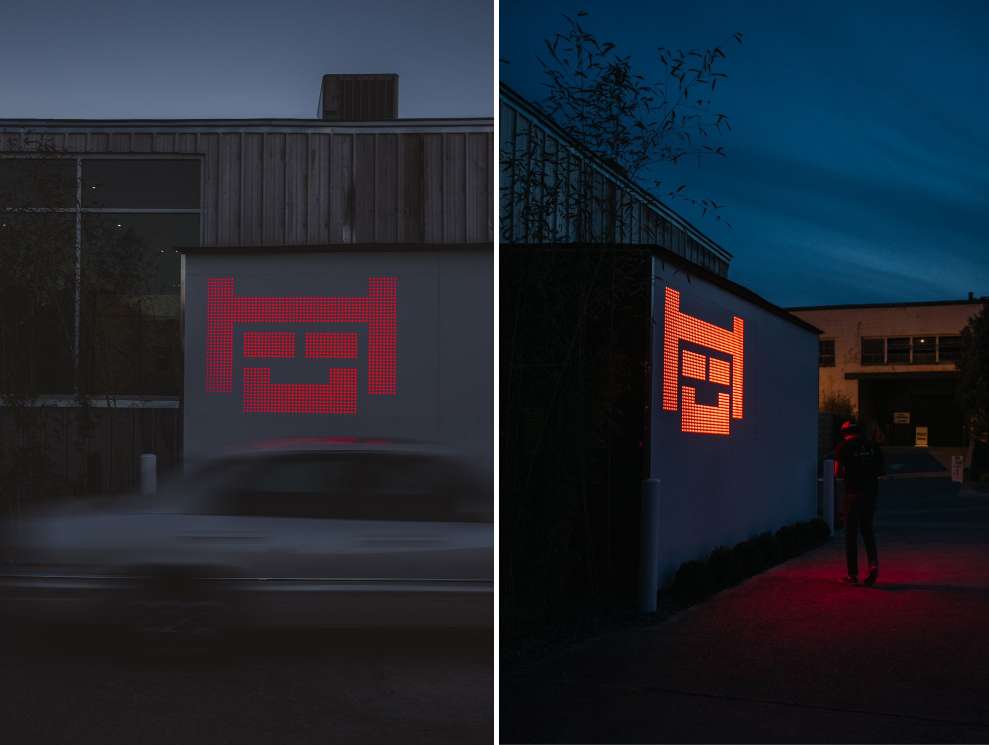
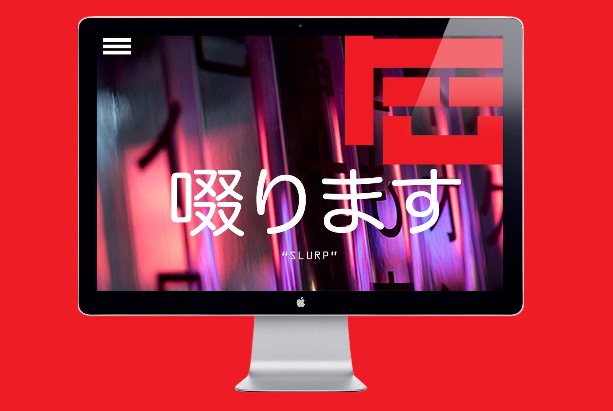
Enter Nihon. An extensive and beautiful typeface designed by Malwin Béla Hürkey that takes traditional western glyphs and gives them a Japanese appearance. A typeface almost tailor made for this project was hard to ignore. Within that typeface we saw that when you flip many of the letter forms on their side they looked like super simple blocky robot heads. Perfect! From that we used many of the letter faces as robot heads to infuse personality and distinction across the branding and visual experience of the space. We hope we did this typeface honor because it certainly felt like the most well matched font to a project we ever paired up.
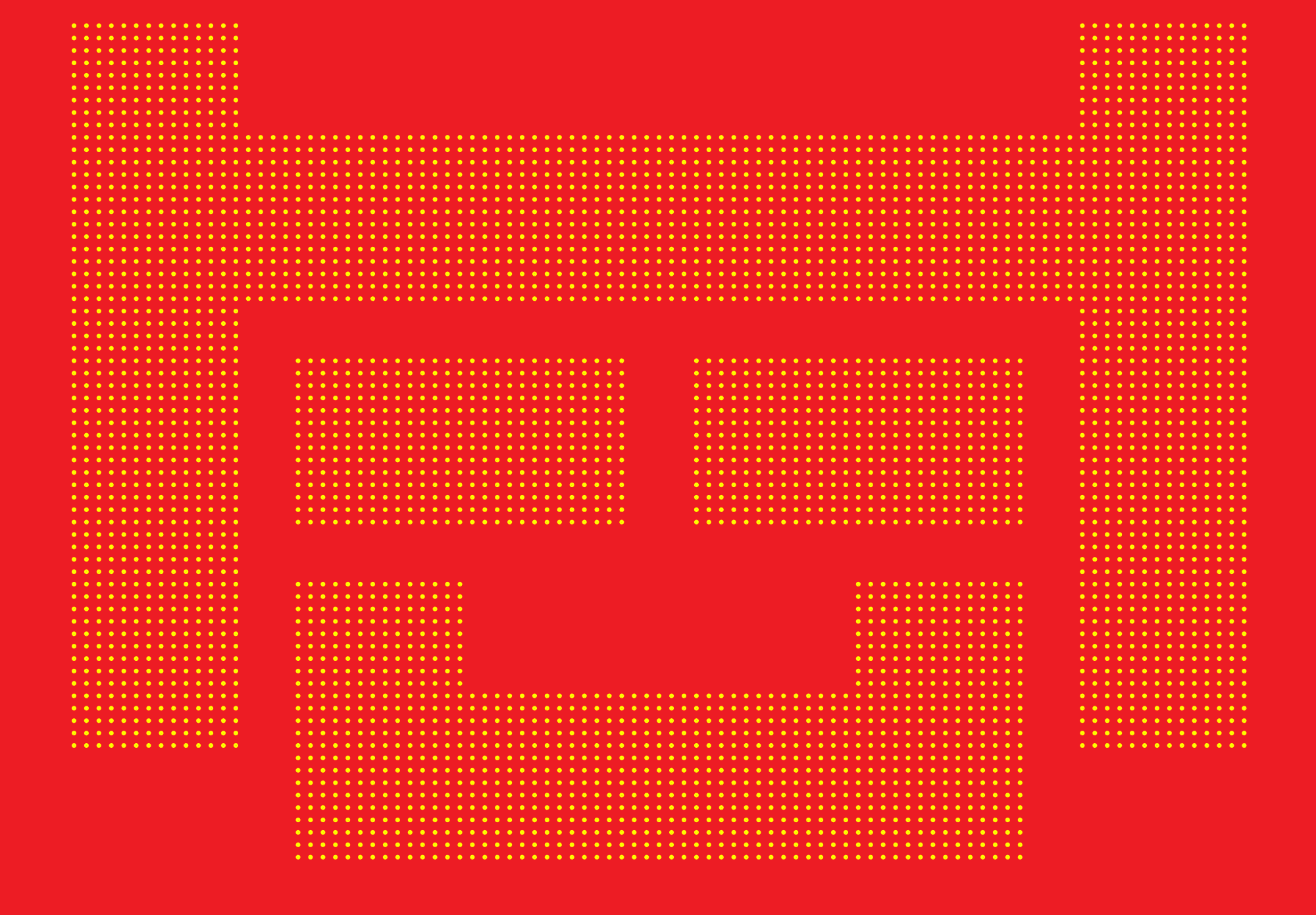
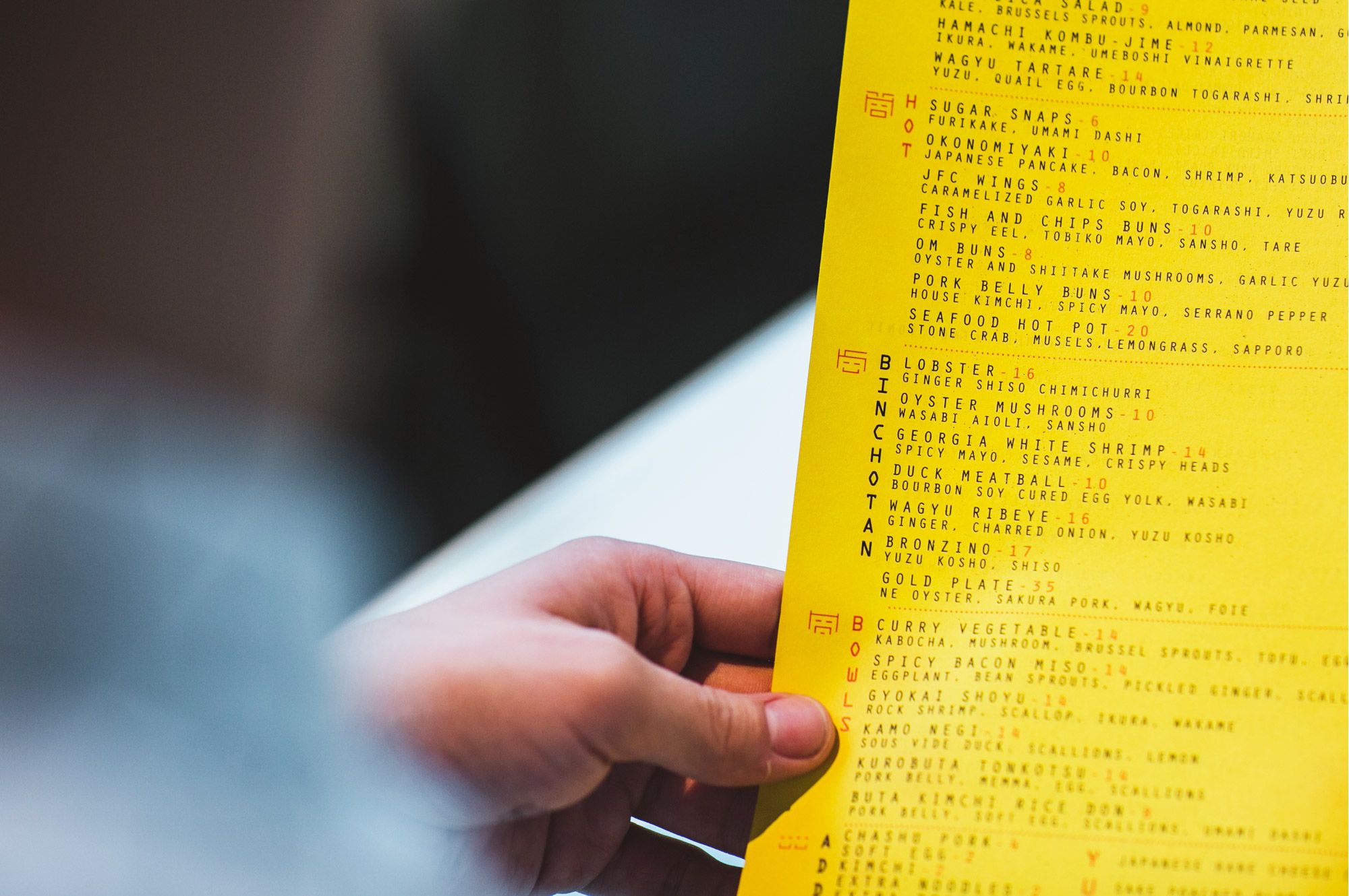
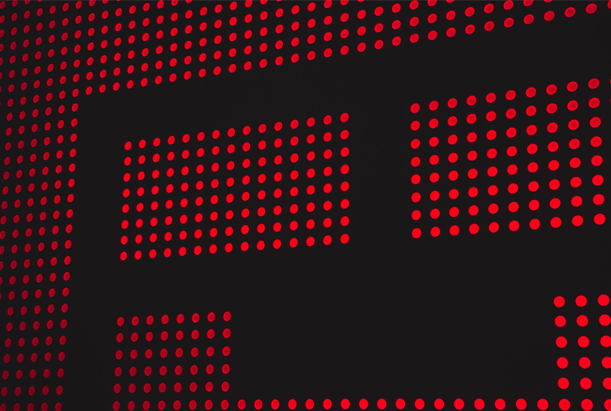
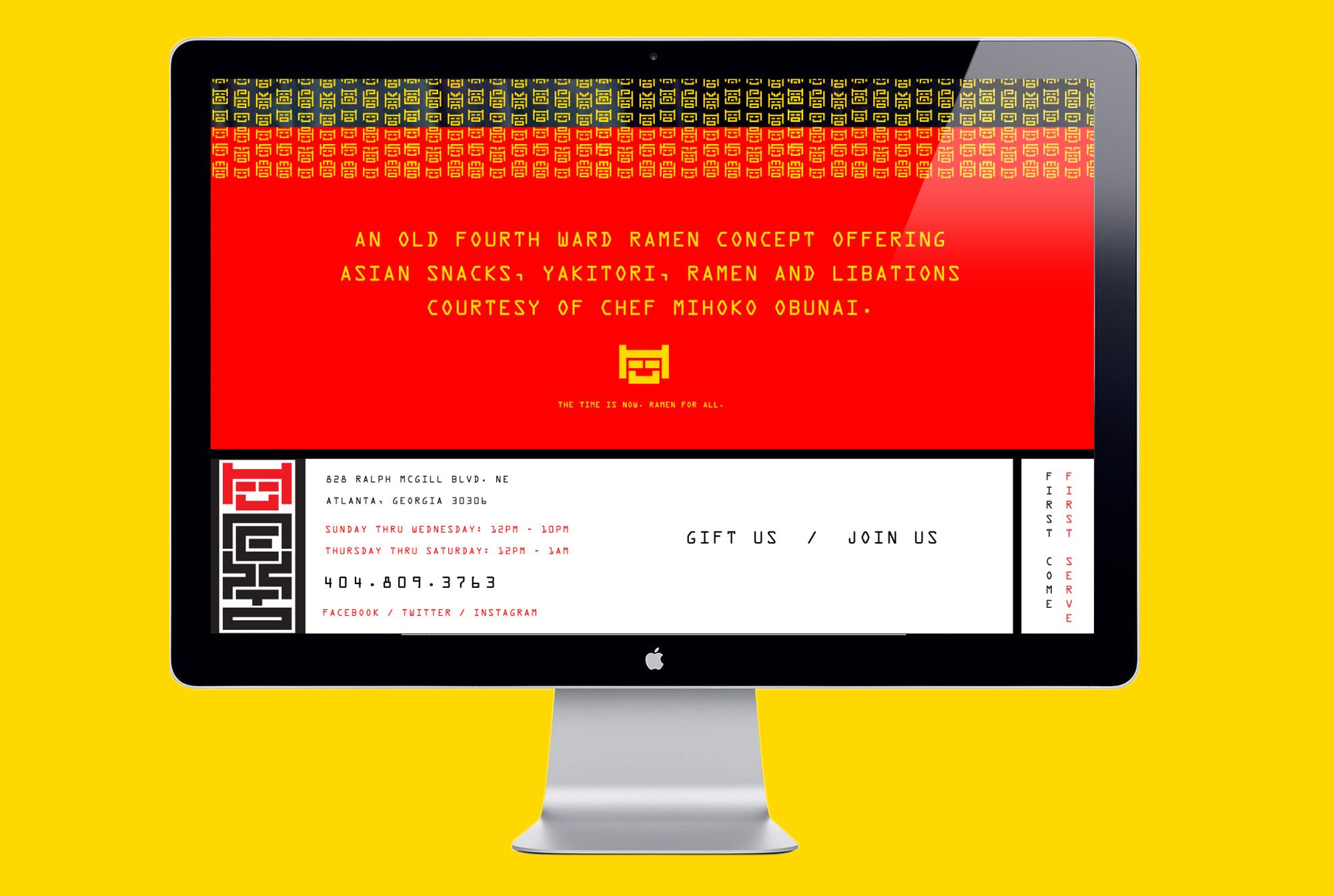
In addition to the branding and collateral we designed the giant robot light dot “sign” which illuminates the entire parking lot, the verbal language, the website and all other promotional materials to be slurped all over!
Services Performed: Naming, Restaurant, Brand Identity, Signage