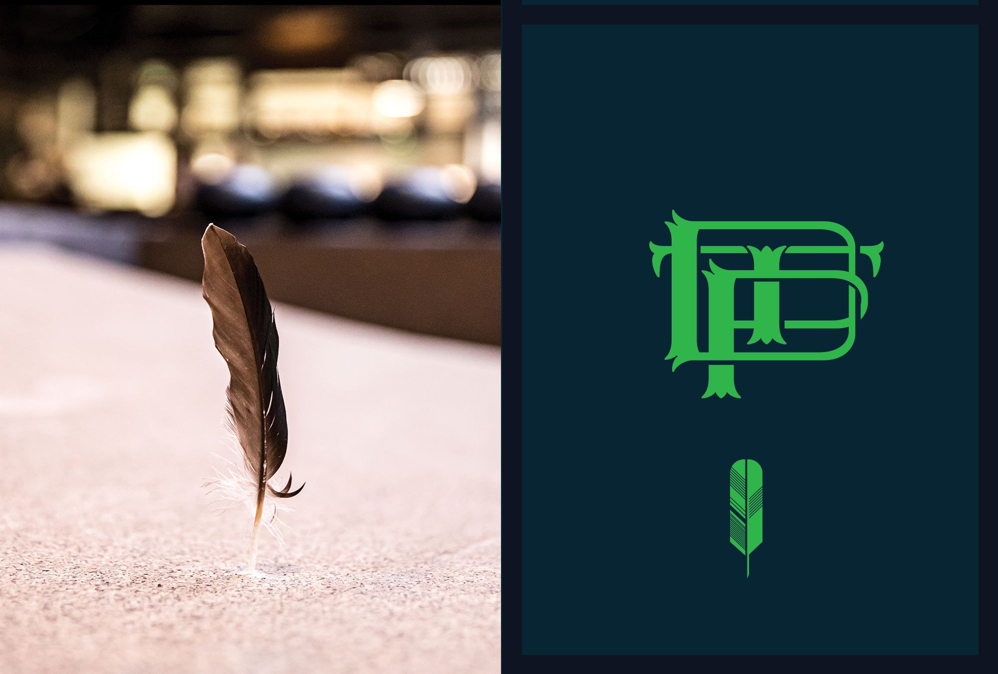
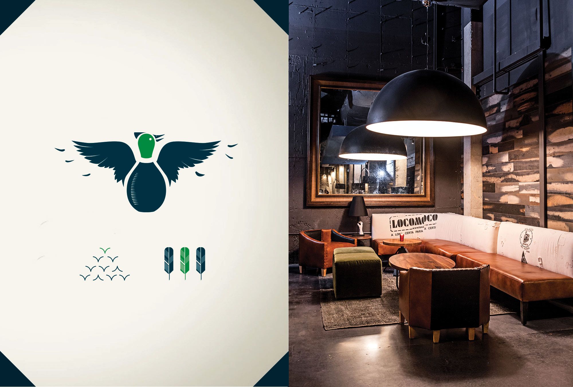
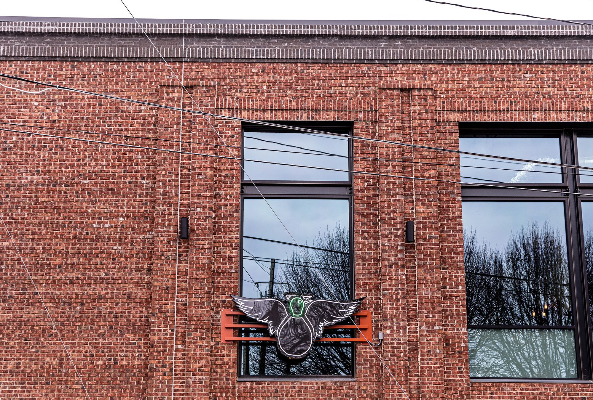
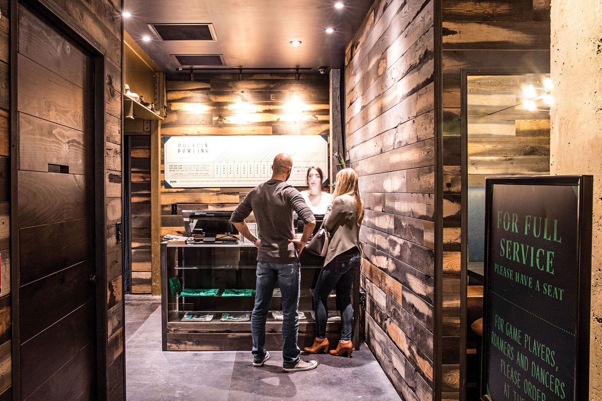
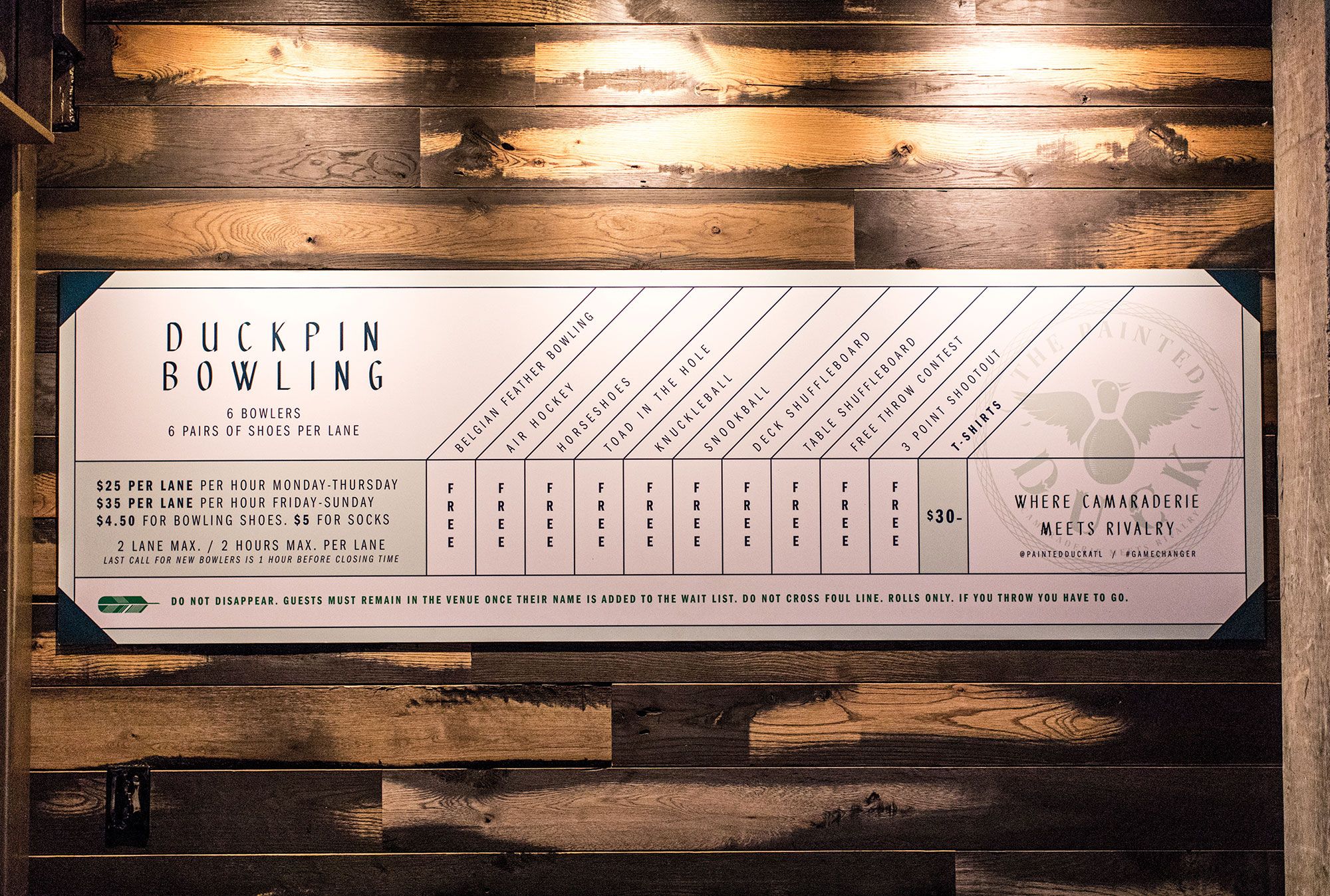
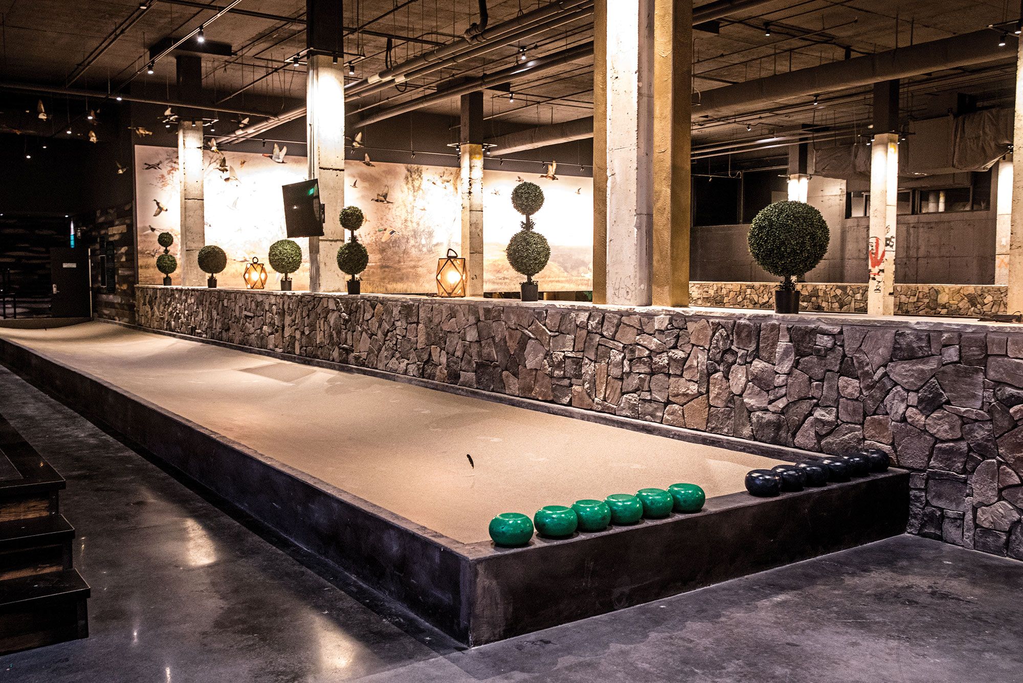
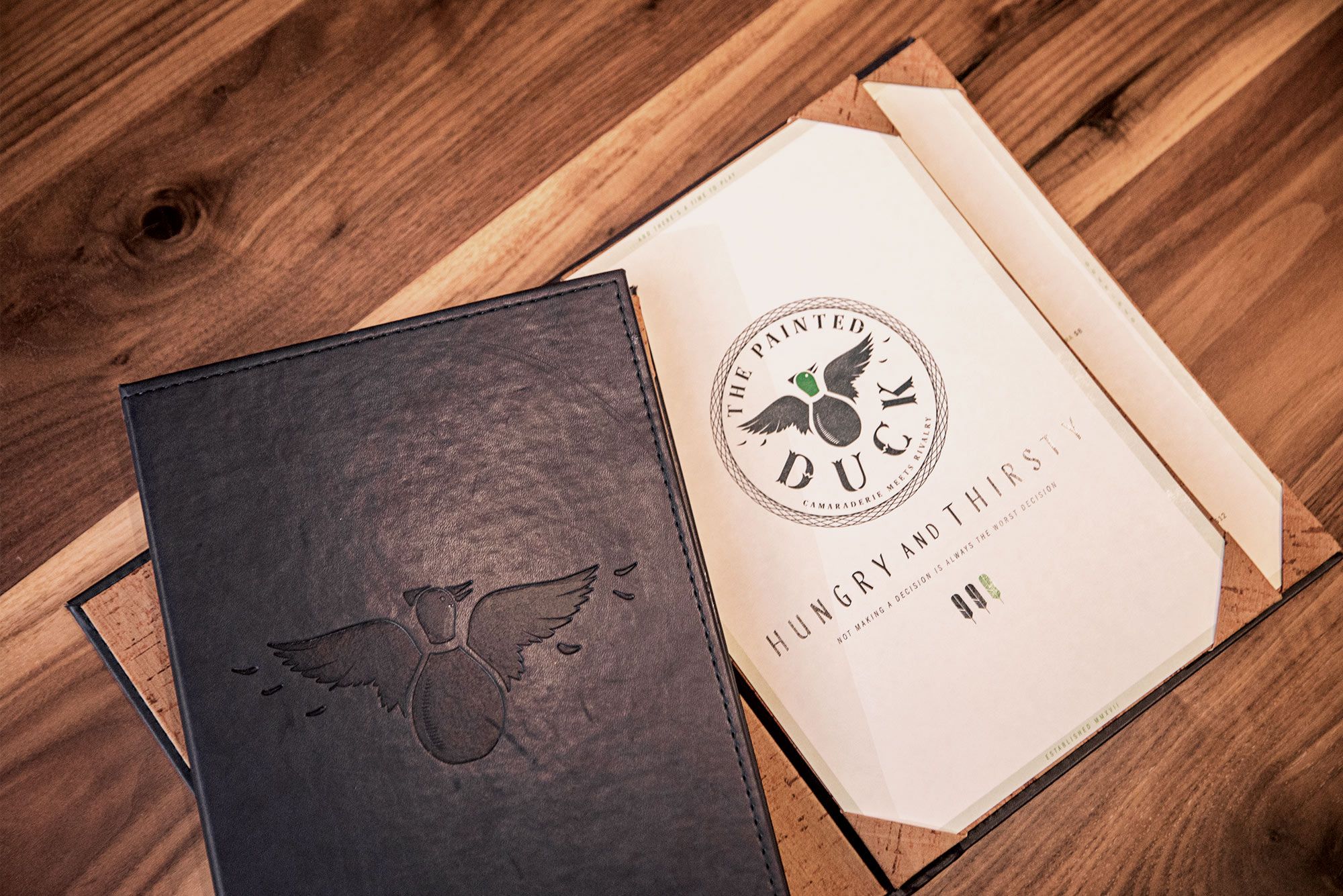
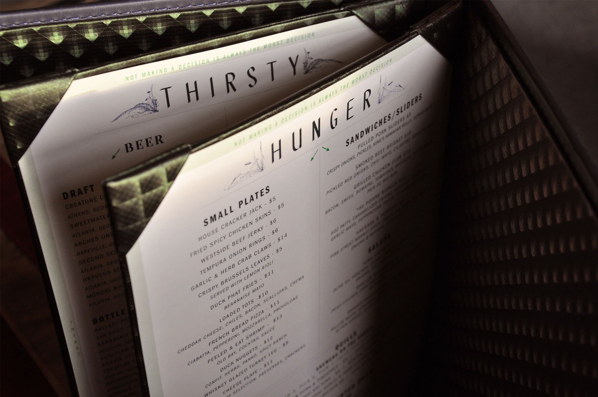
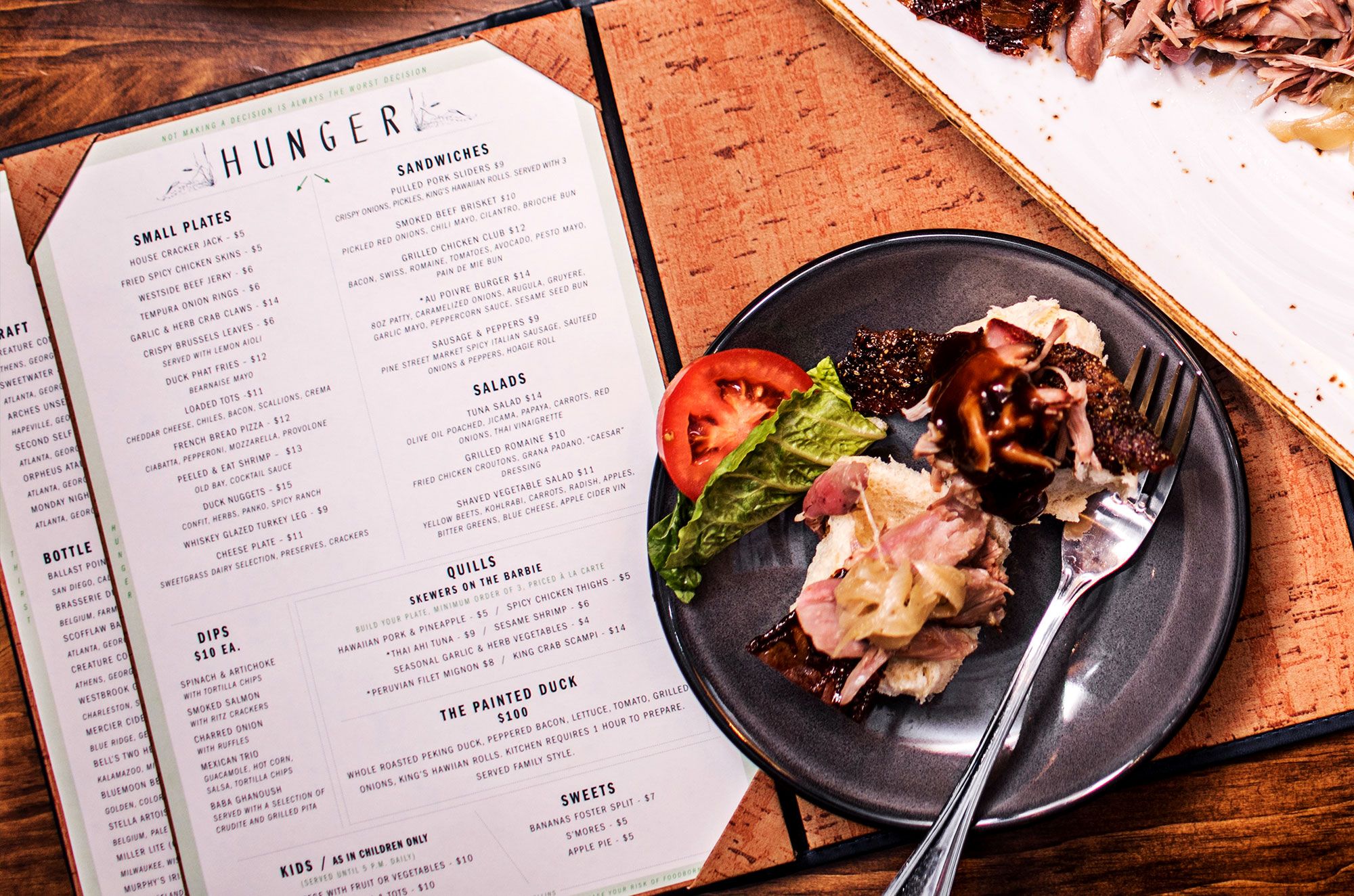
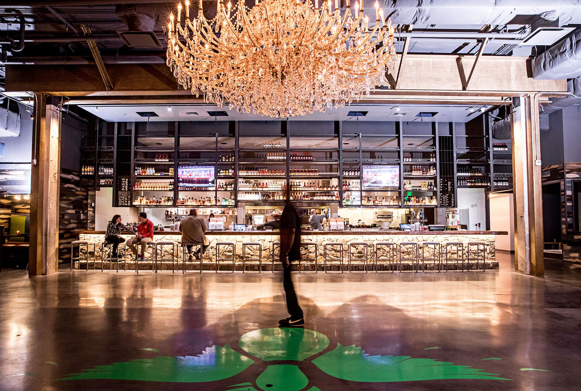
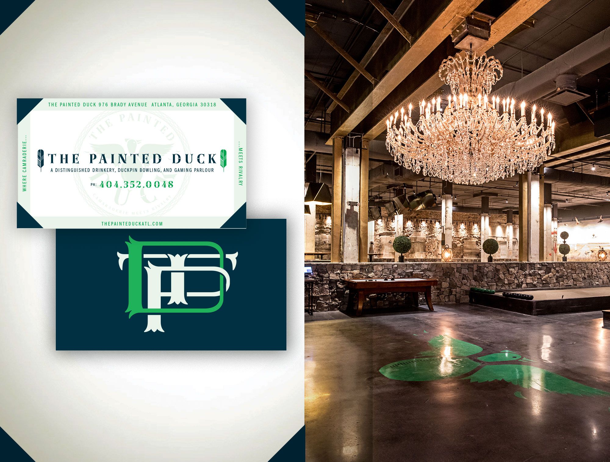
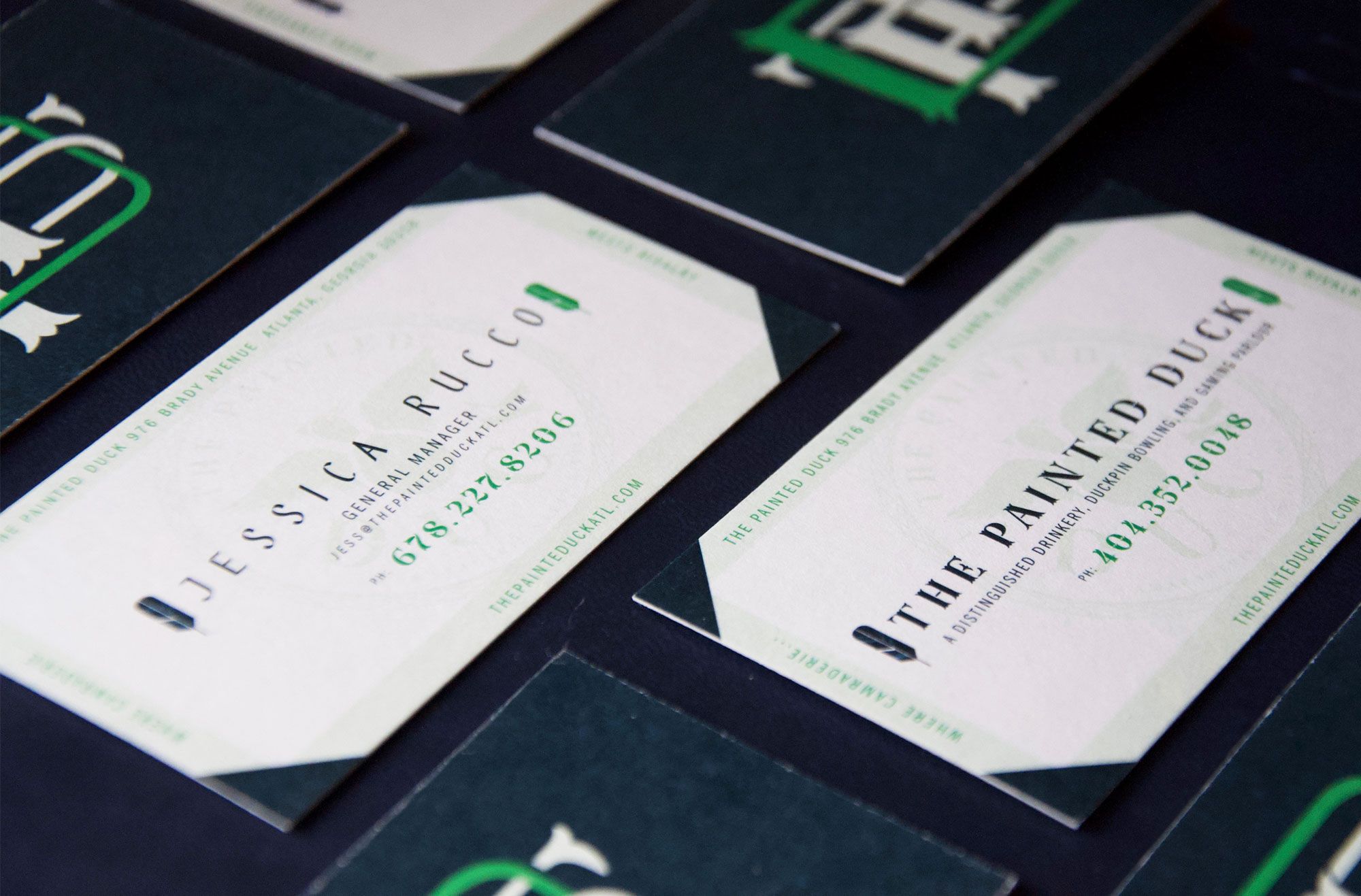
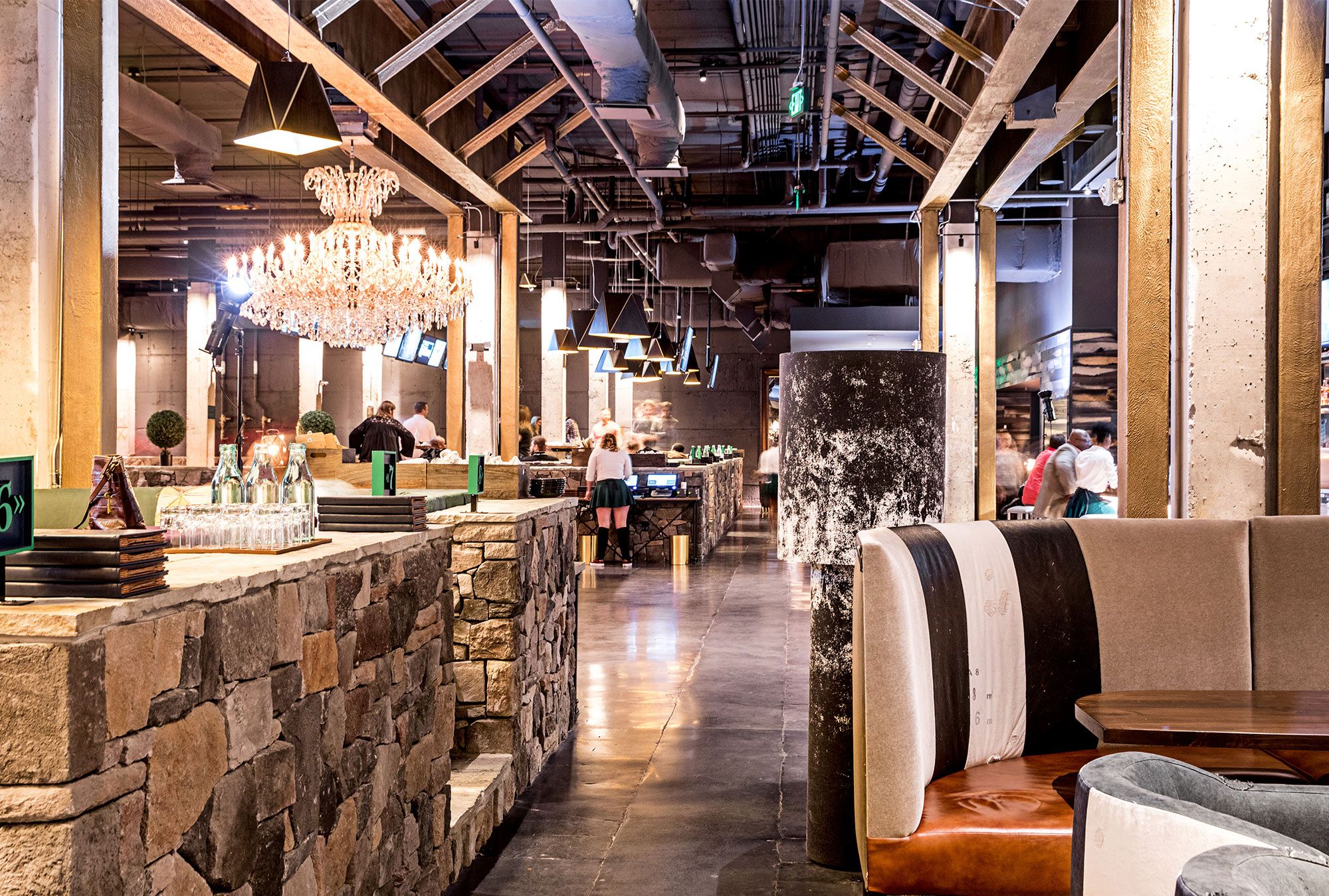
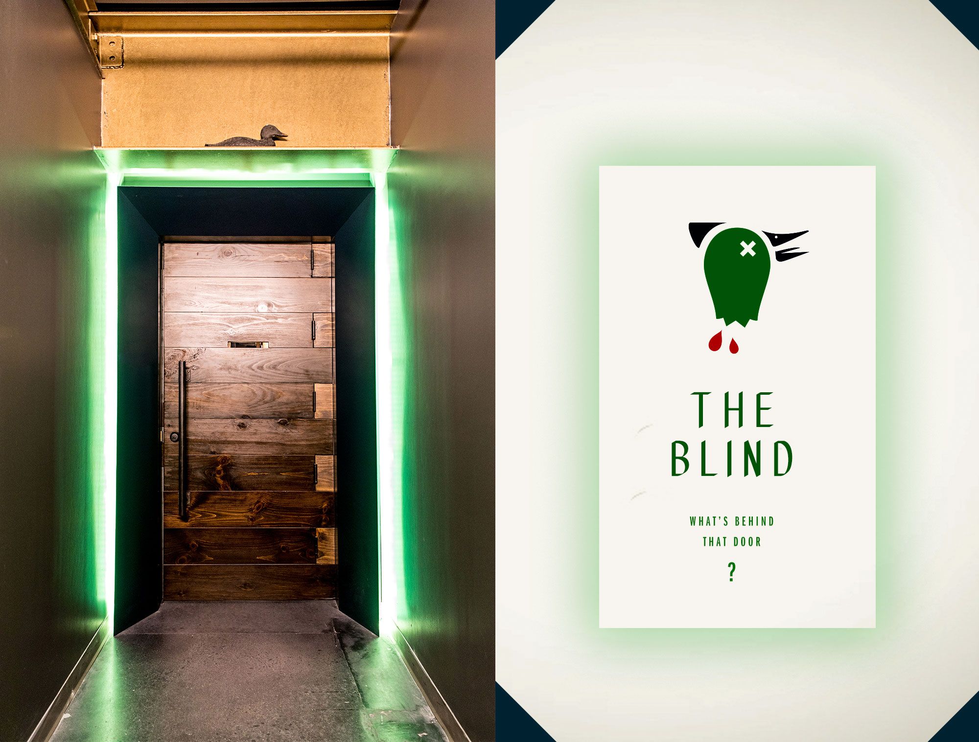
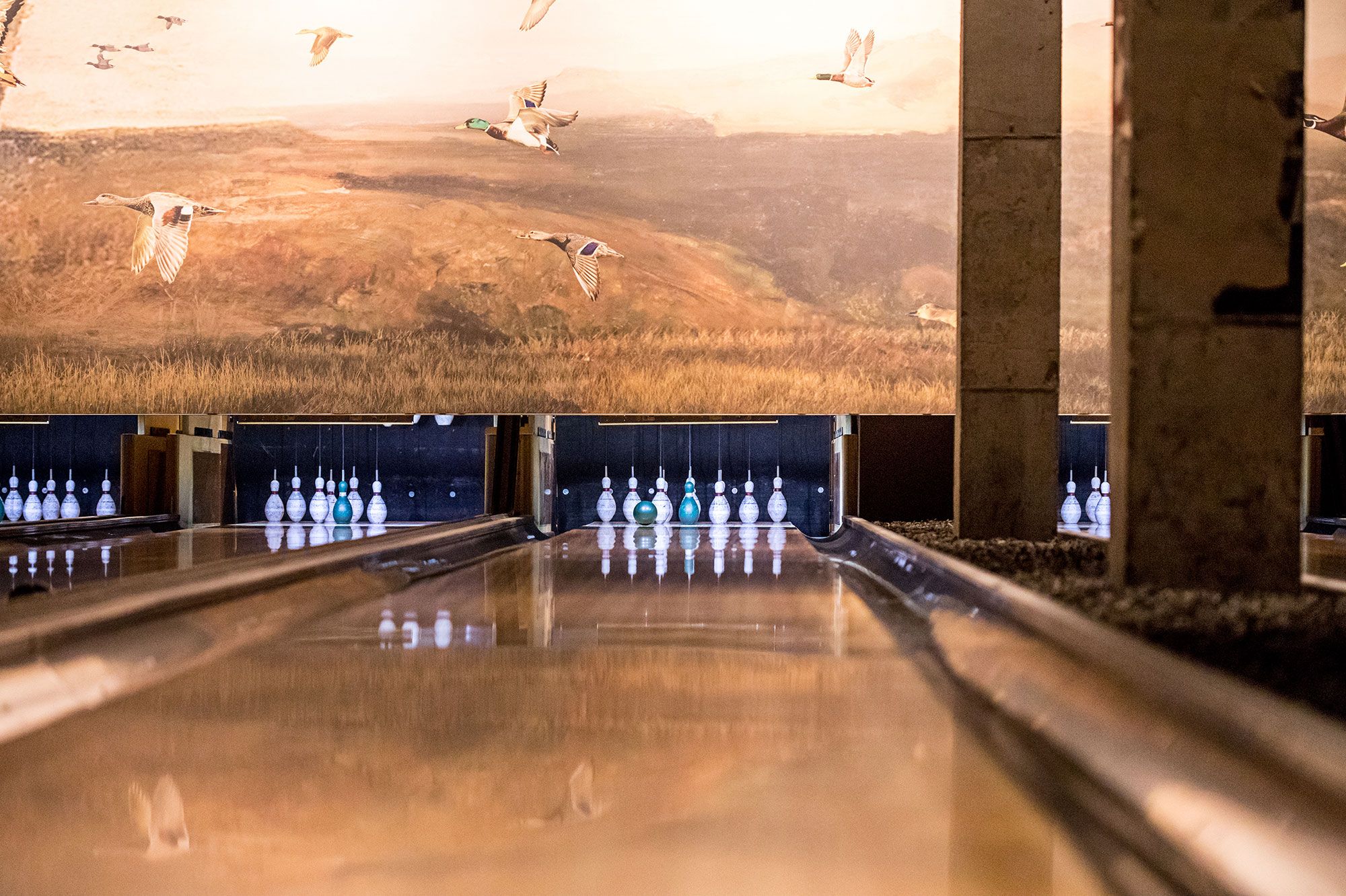
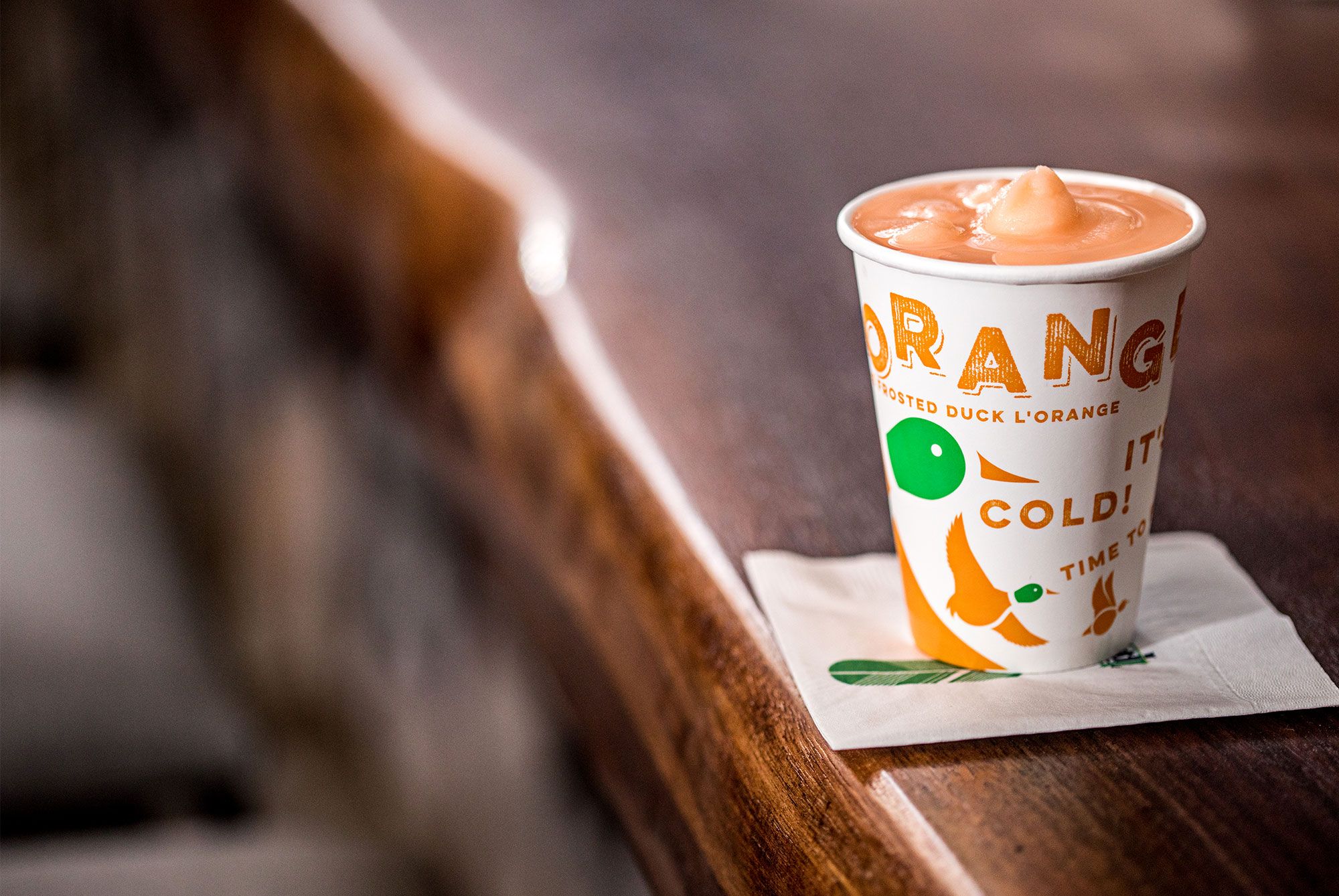
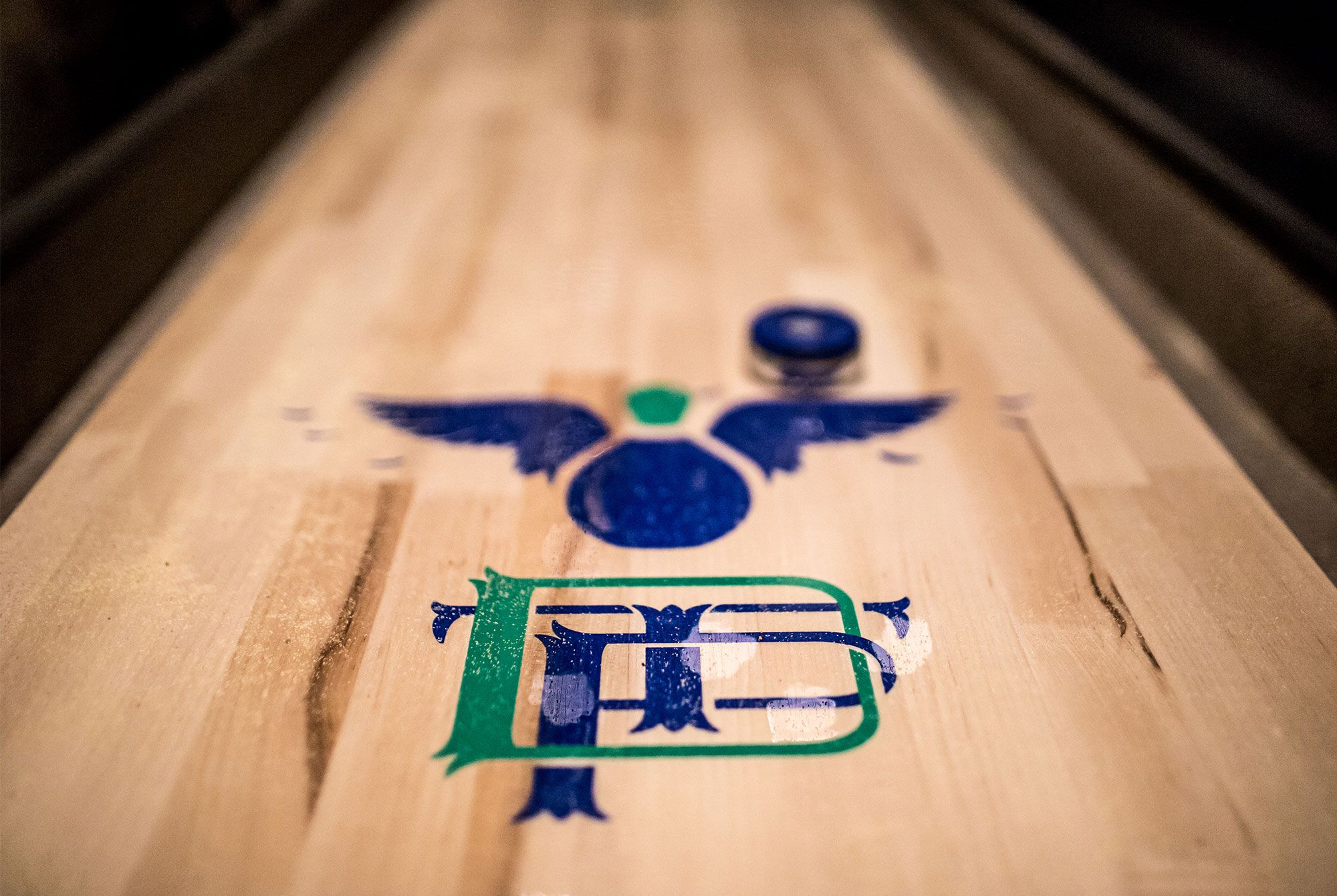
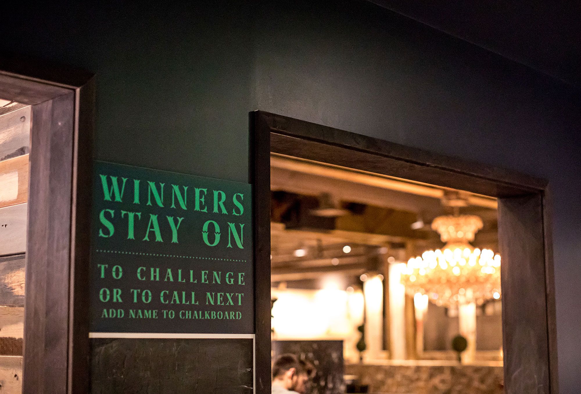
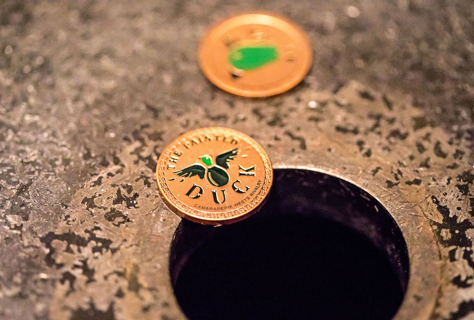
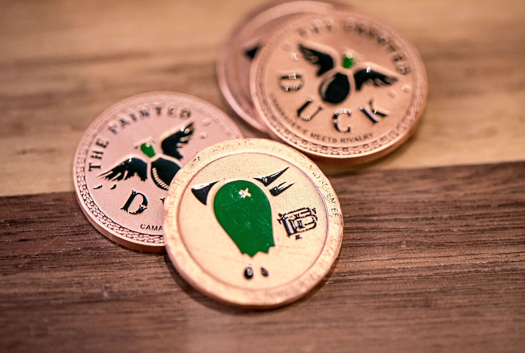
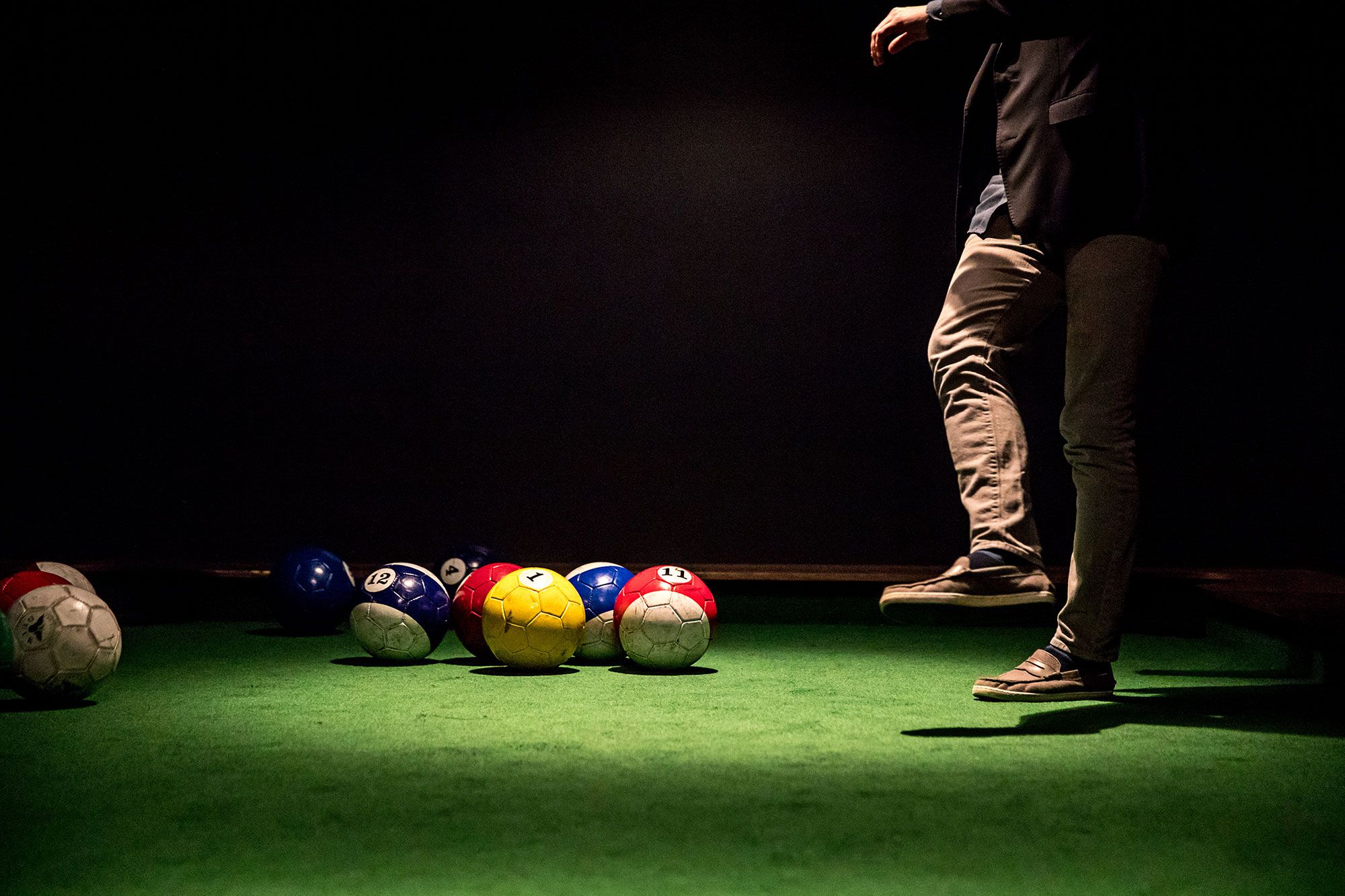
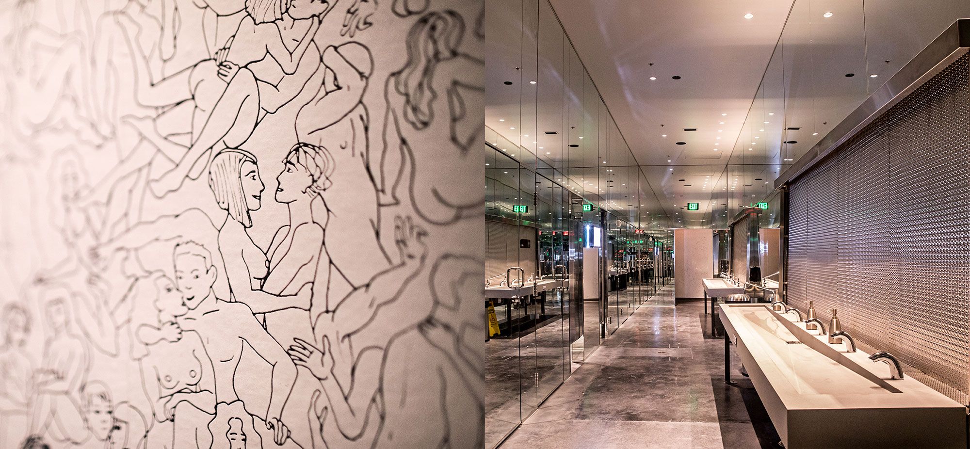
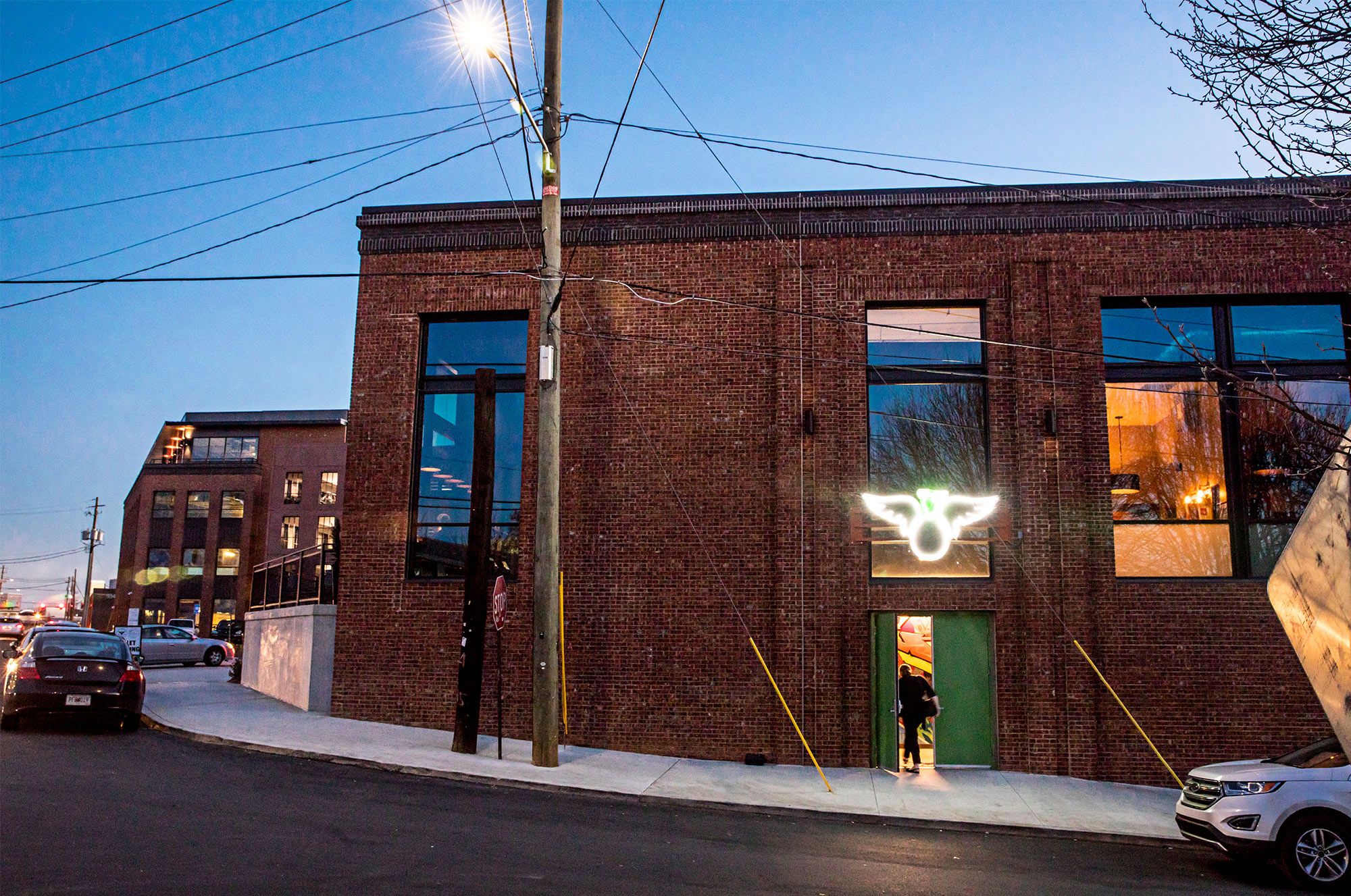
IN THE STOCKYARDS OF ATLANTA, GEORGIA, WE FIND A NON-DESCRIPT BUILDING HOUSING AN ENORMOUS DUCK PIN BOWLING ALLEY AND MUCH MORE. The sibling to The Painted Pin, found down a flight of stairs through a graffiti covered corridor in a basement, opens up to a stunning space of off-beat games, bowling, restaurant and bar. The Duck gets some nice momentum from the success of The Pin but its the "wow-factor" of The Duck that will get people coming back and standing on line to get in. When the invite came through to start the branding for this one it was a "Yes, yes already started!!" Pictures say the rest. The logo almost designed itself. When you look at a duck pin, well, it looks like a duck. Add wings and a beak! From there though we wanted to use elements that felt like a hunting lodge lined with books on nature. We chose appropriate leafy and dated typography while matching brand aesthetic to this industrial meets high-quality space. The menu comes in a leather bound debossed book where some are lined with a patterned shiny paper that reflects light similar to a duck's feather. The other is a cork paper that has the look and feel of peeled tree bark. A tactile menu for an establishment that keeps your hands busy and belly happy.
Services Performed: Website, Restaurant, Brand Identity, SignageTHE PAINTED DUCK
UPSCALE DUCK PIN BOWLING AND GAMING