MIGO SPECIALIZES IN MEDIA AND ENTERTAINMENT DISTRIBUTION IN THE FRONTIER OF EMERGING ECONOMIES ACROSS ASIA, where entertainment-hungry consumers are unable to gain easy access. The design challenge was to develop an engaging brand identity that local youth could relate to and quickly identify in the visually crowded streets of their cities.
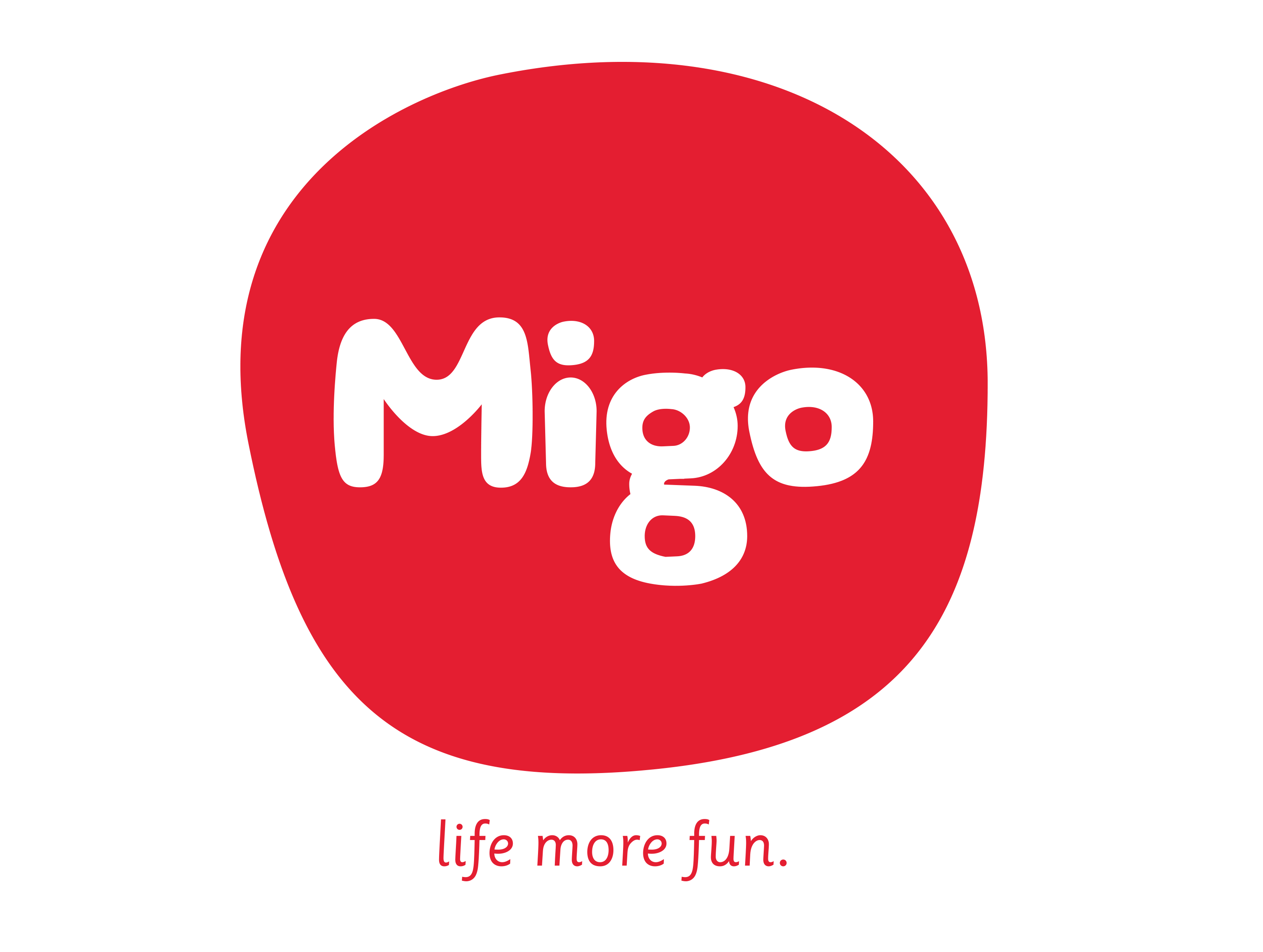
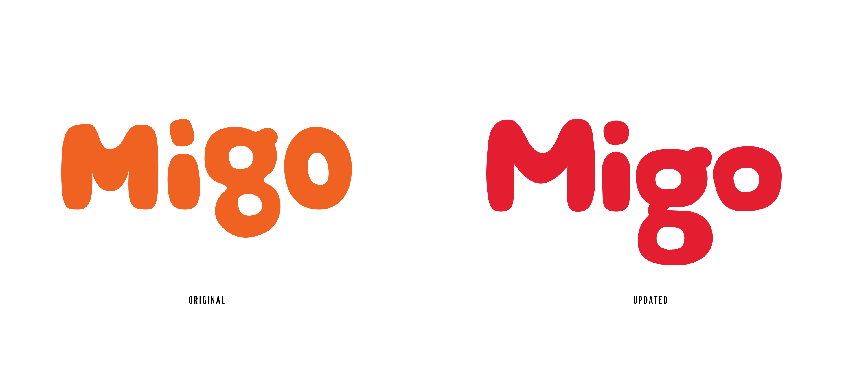
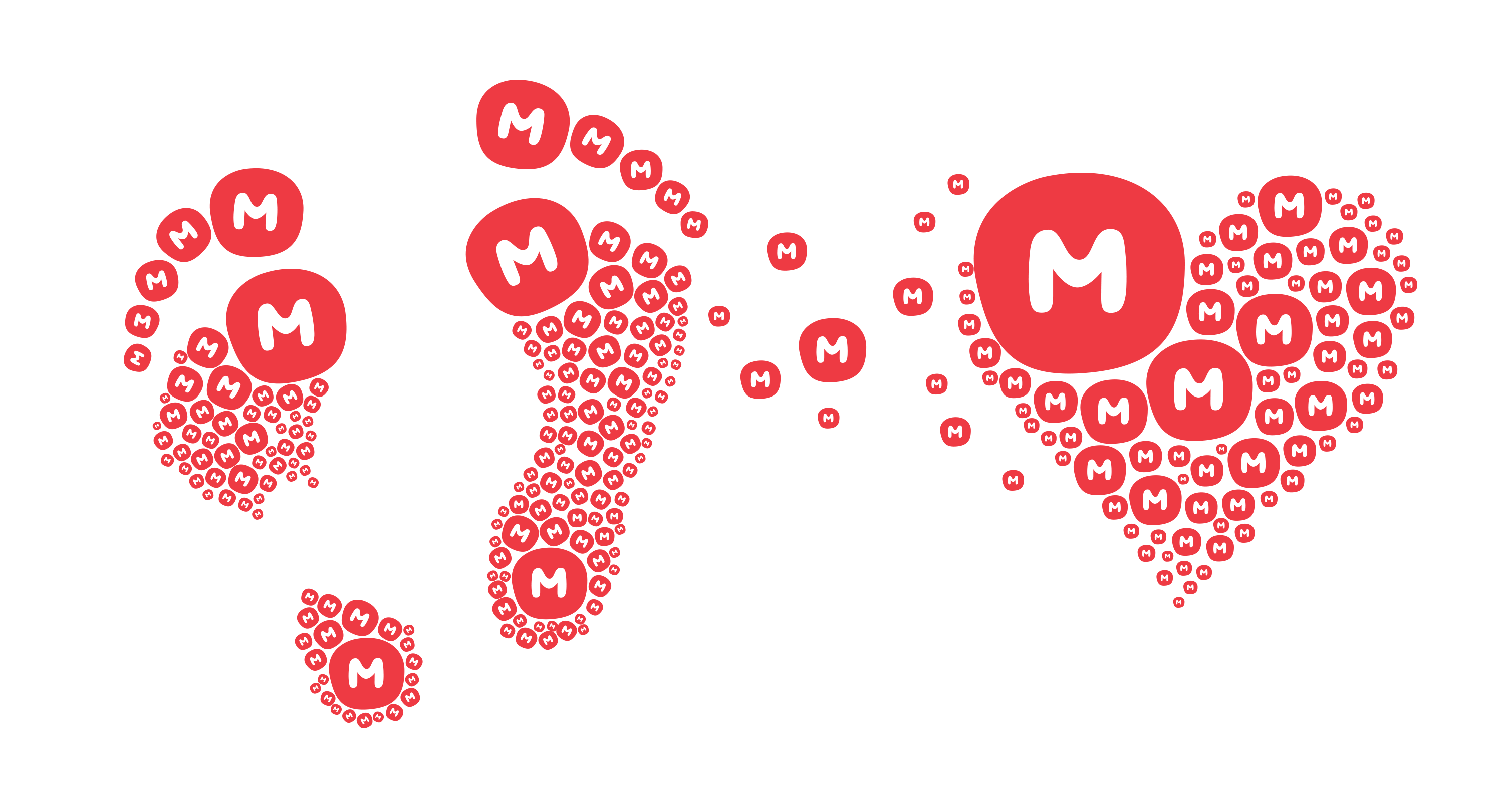
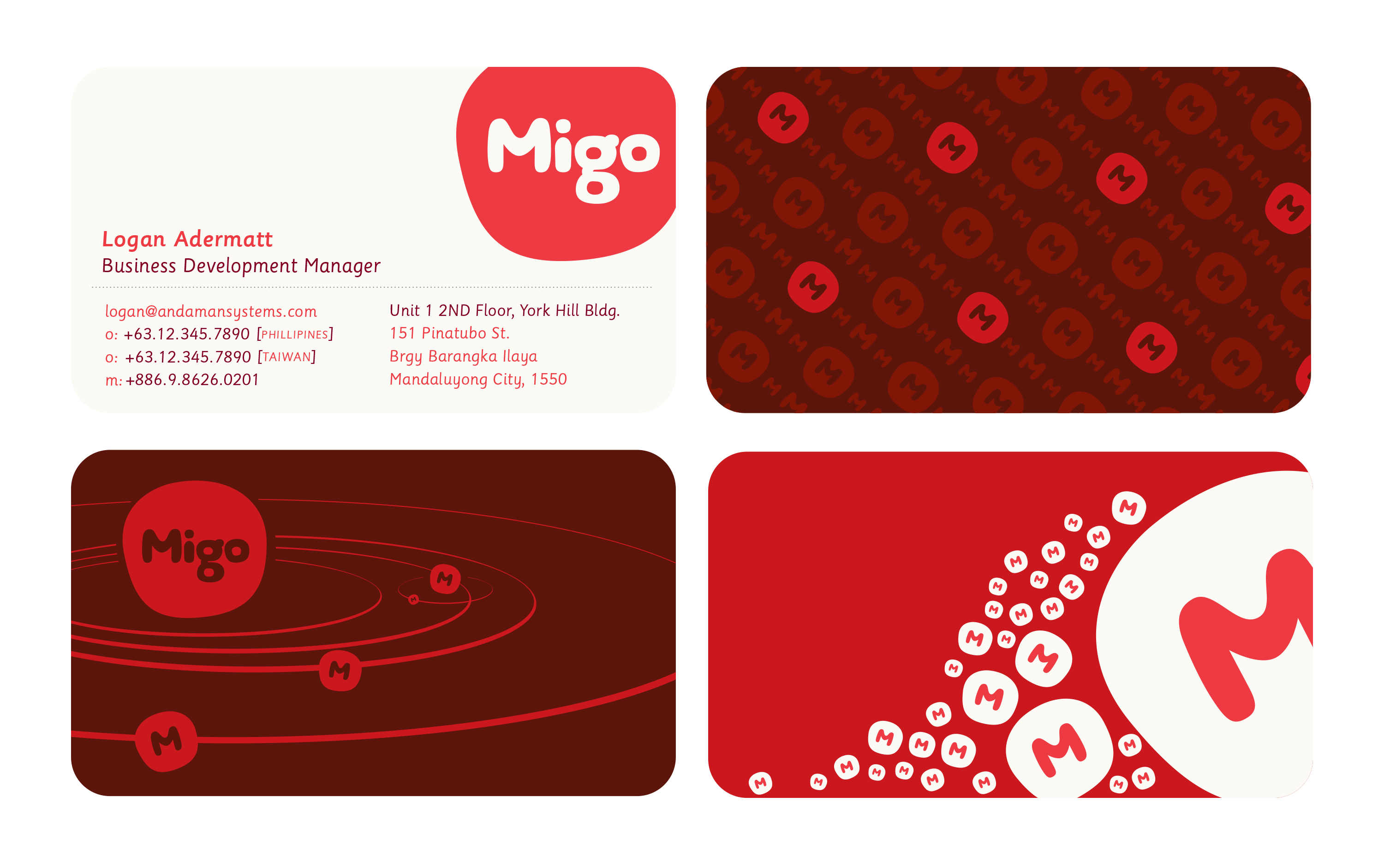
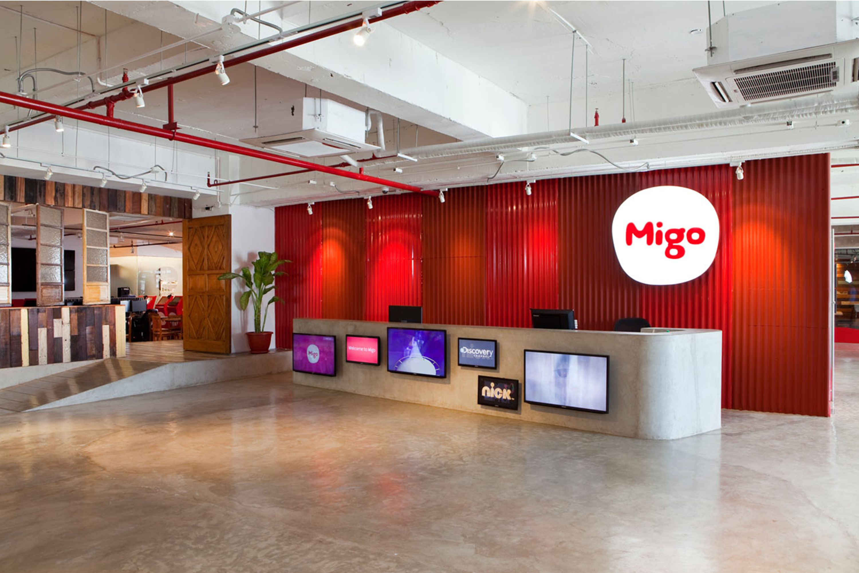
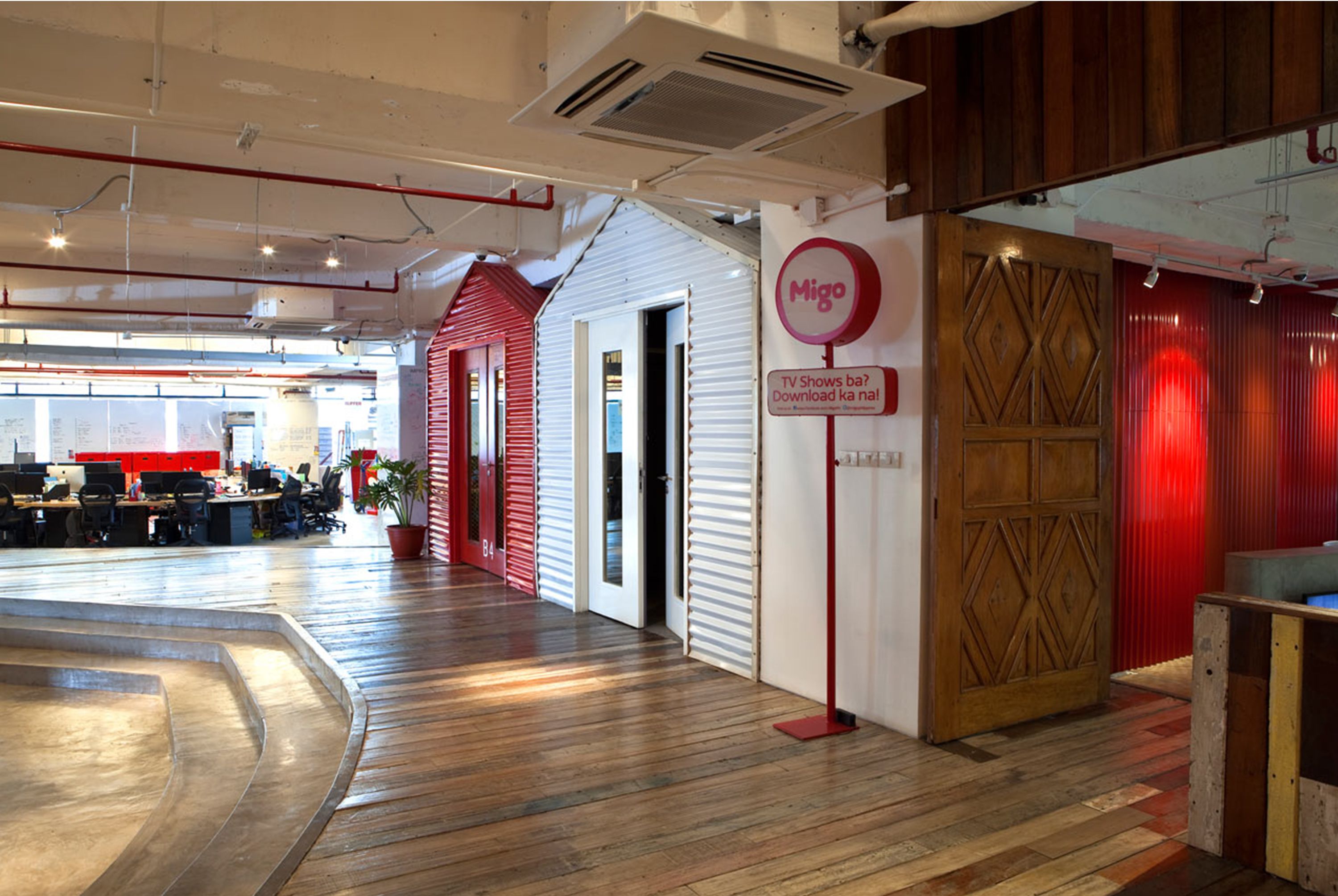
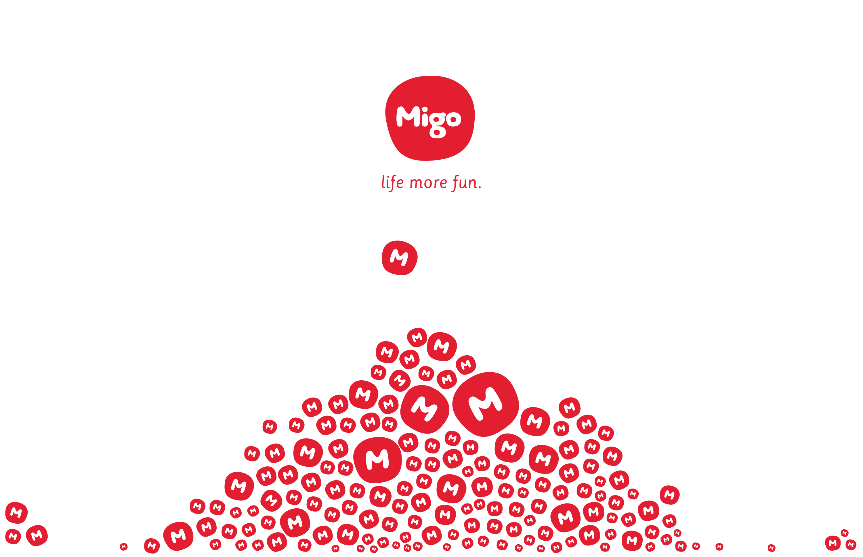
We began by rebranding an early iteration of the logo and expand it into a full branding strategy. The first objective was developing a very legible and custom logo-type that was playful and legible. The final logo has the type placed in an amebic red bubble to give it added presence. Red was chosen for its cultural significance of being lucky in South East Asian countries. Smaller icons of the "M" in the bubble help identify kiosks (M-Spots) and provide direction.
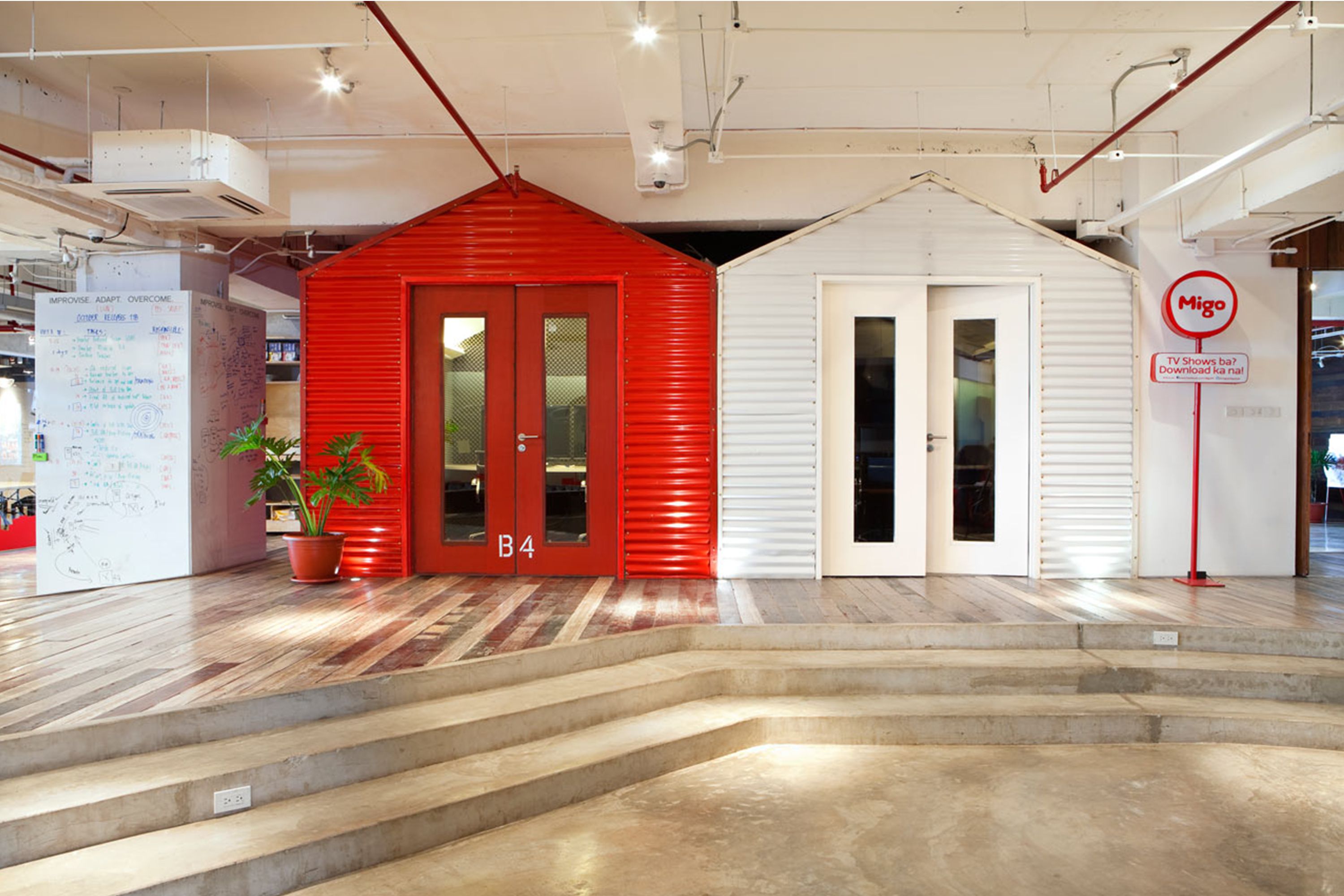
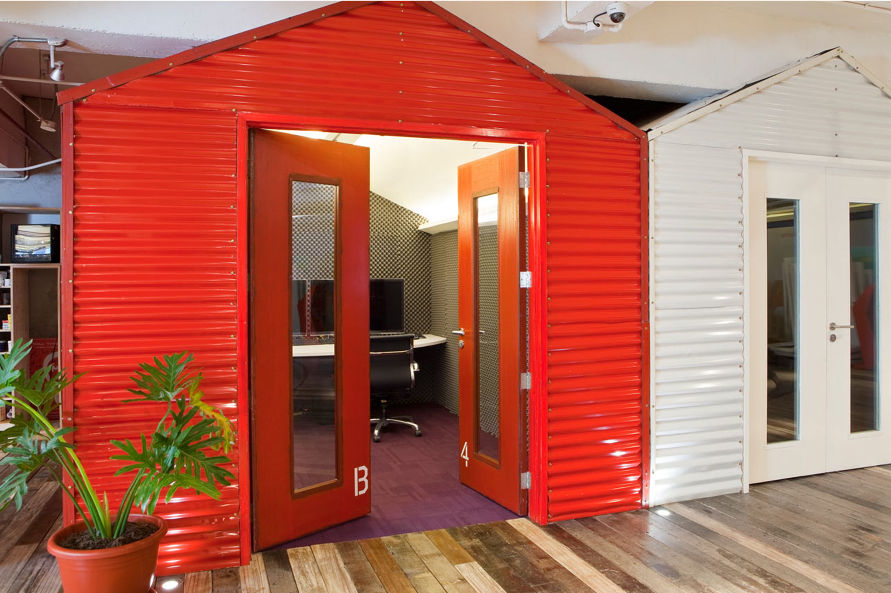
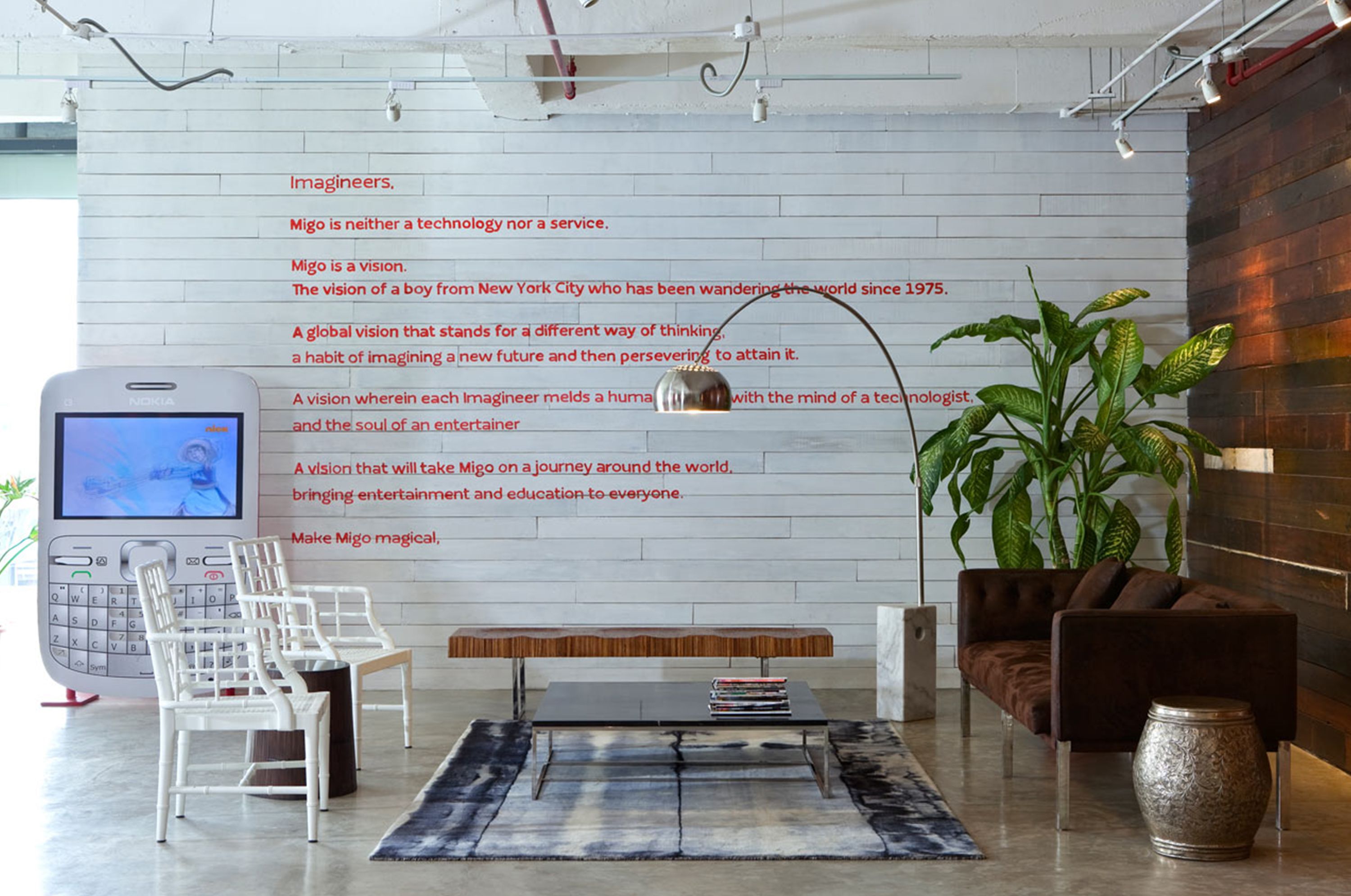
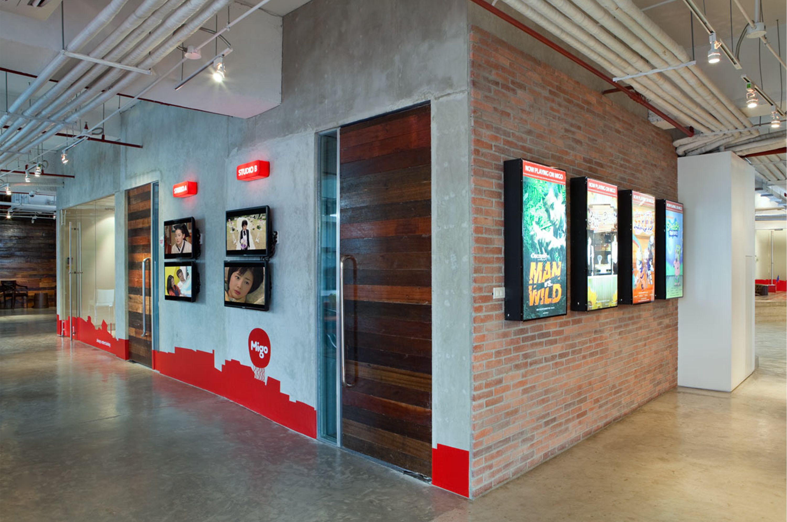
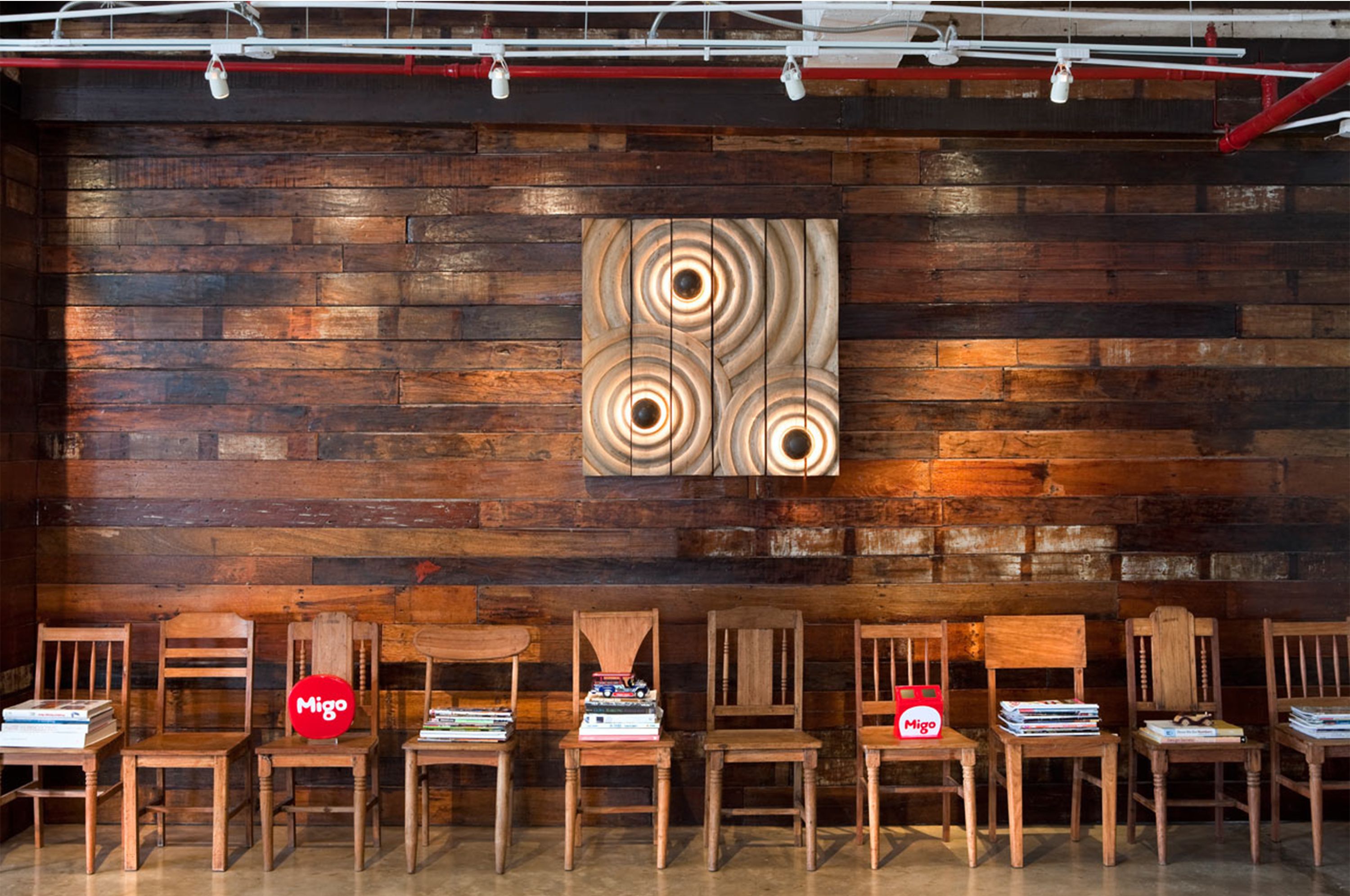
We used many M-Spot icons together to create new images from feet on floor stickers, giant hearts and the solar system. The goal is to engage the market with a playful brand dialogue in order to visually "teach" a consumer how to find this brand in their world. Migo's corporate office designed by Utwentysix demonstrate the brand's laid back yet, collaborative and creative culture. This innovative design completes a full and rich brand story for Migo and its consumer connection.
Services Performed: Art Direction, Brand Identity