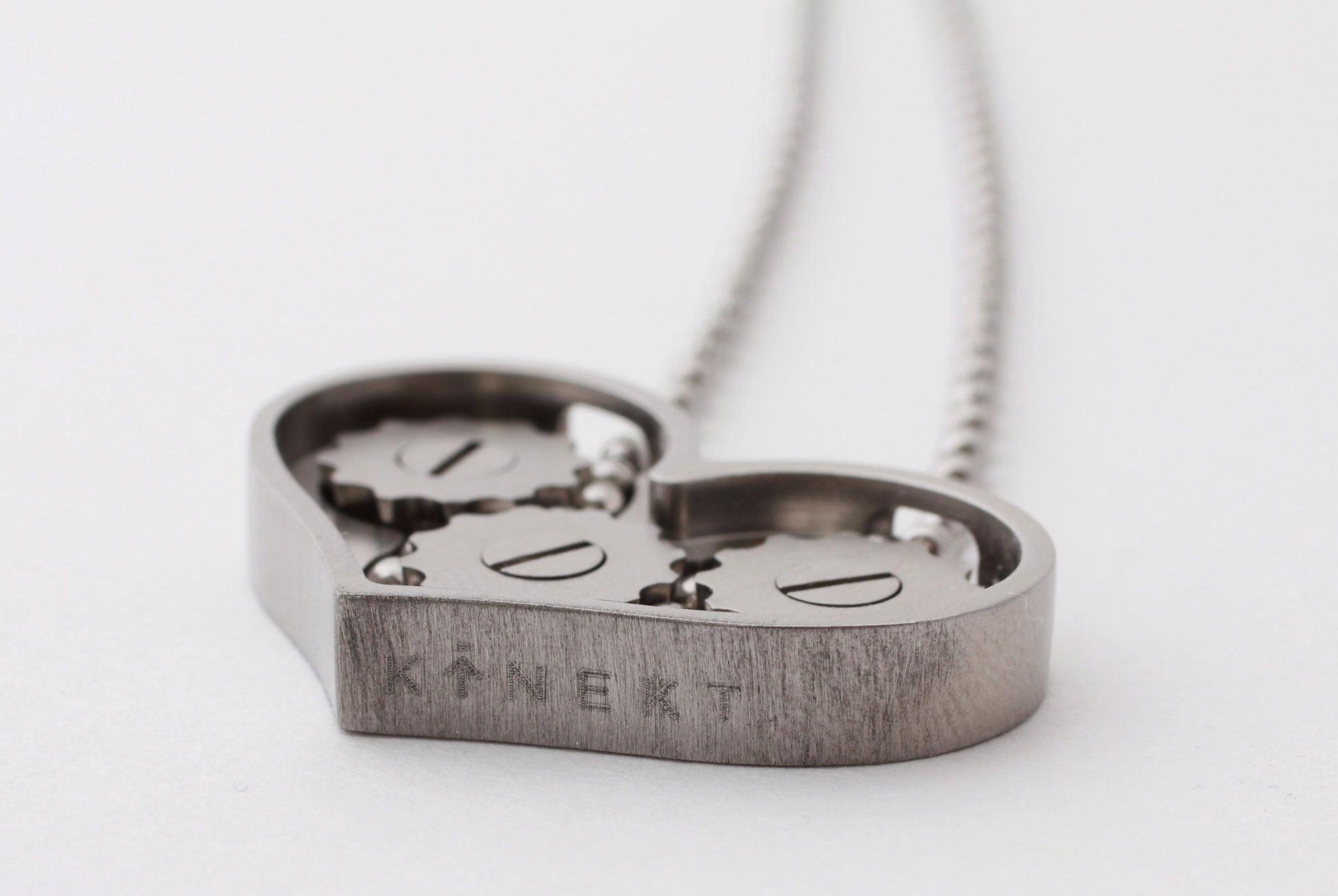
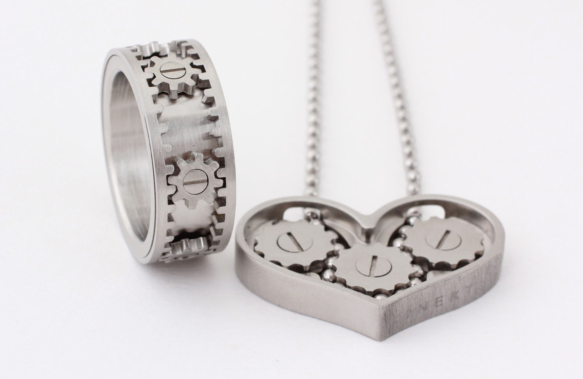
KINEKT DESIGN IS A SMALL FAMILY RUN COMPANY THAT INVENTS, DESIGNS AND CREATES UNIQUE JEWELRY AND PRODUCTS. Founded in 2010 with the invention of the Gear Ring they tapped into a customer base eager to own and wear products that are more than just ornamental but are interactive, unexpected and conversation pieces. They came to BoyBurnsBarn looking for a full brand overhaul including new logo, tagline and packaging to go along with their expanding vision and product line.
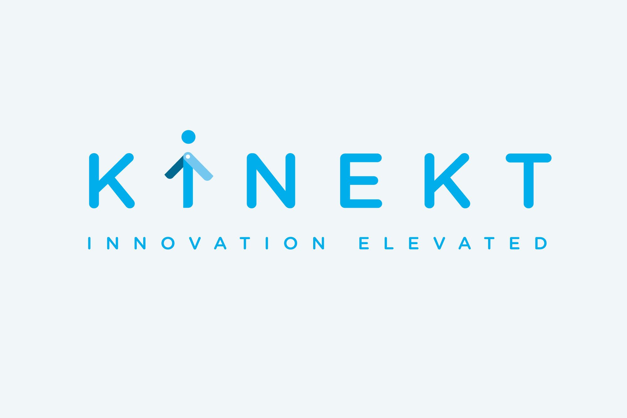
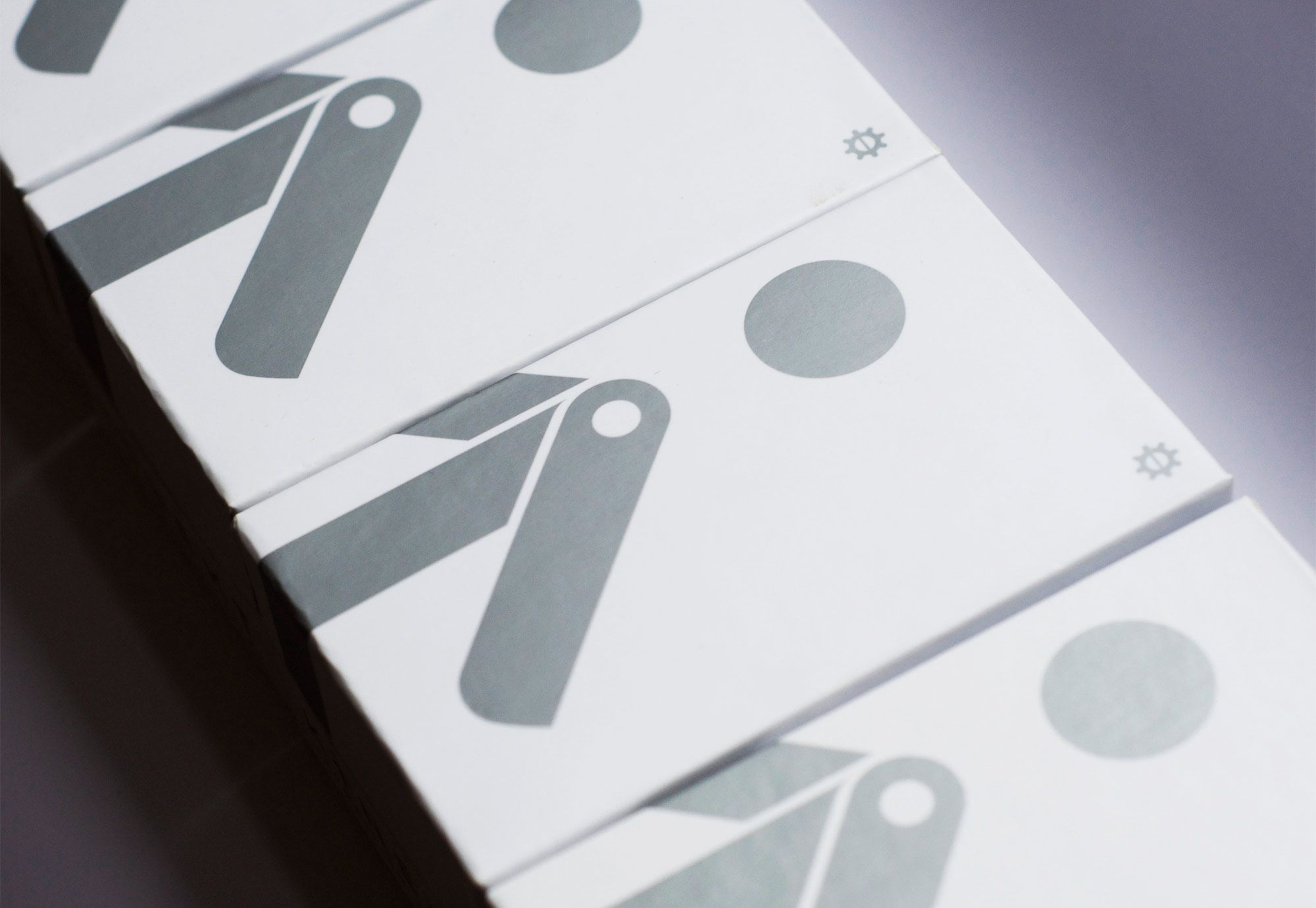
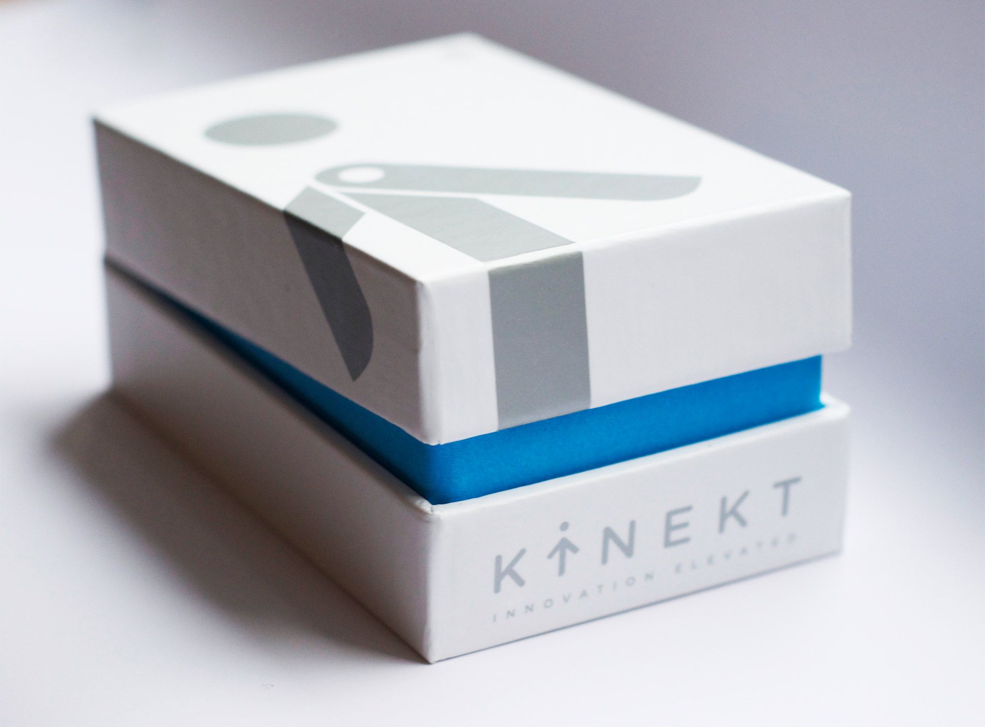
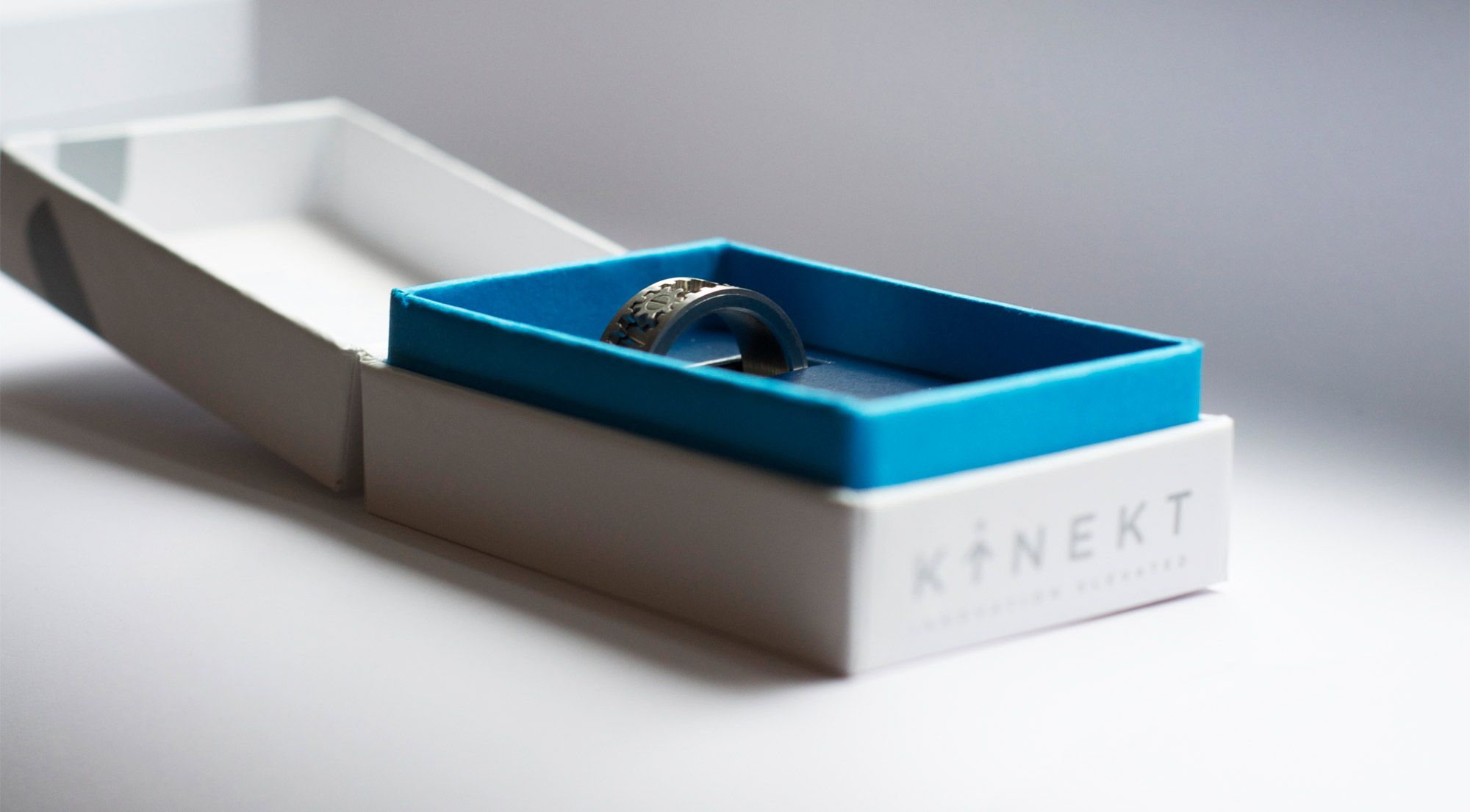
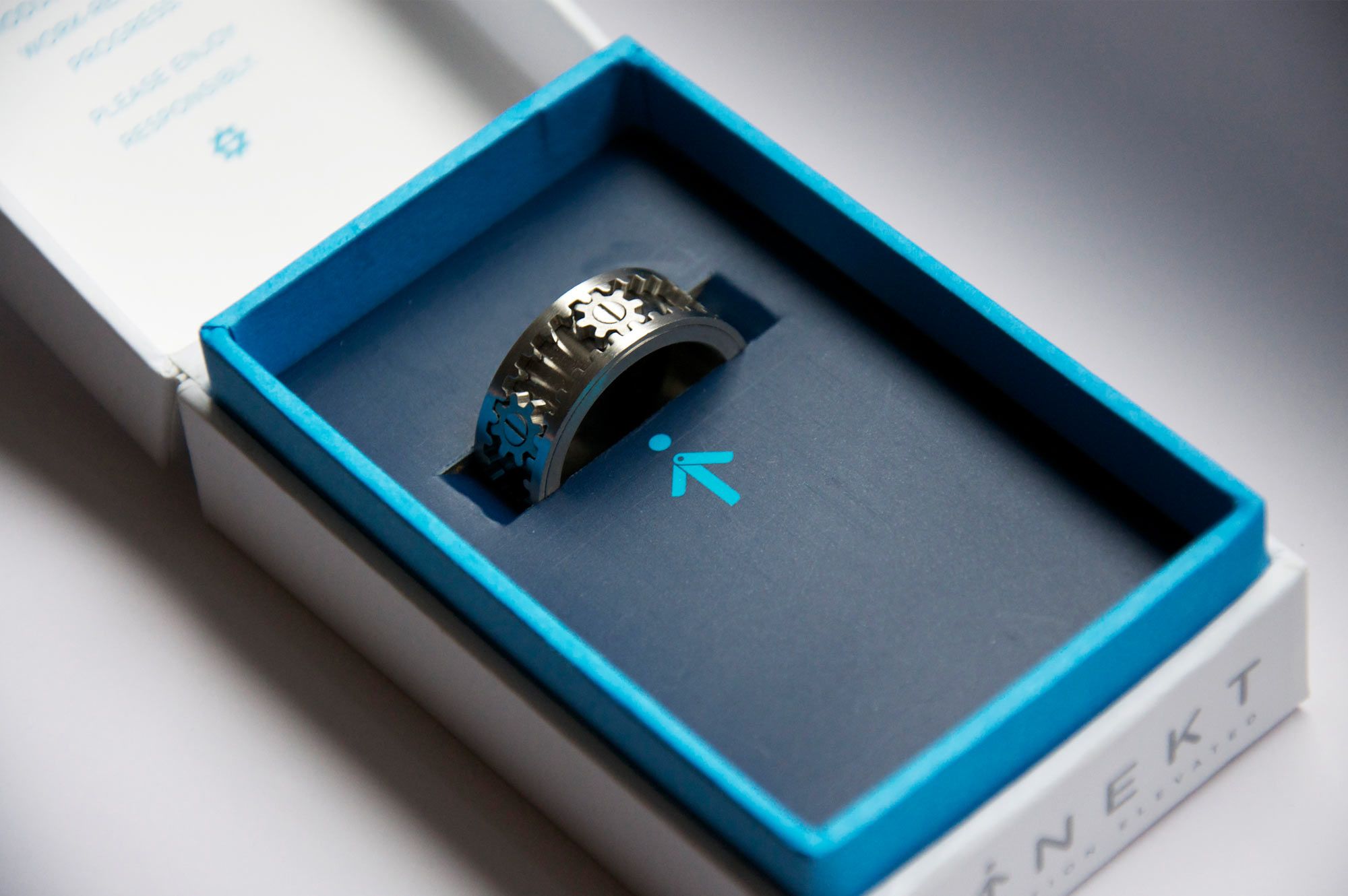
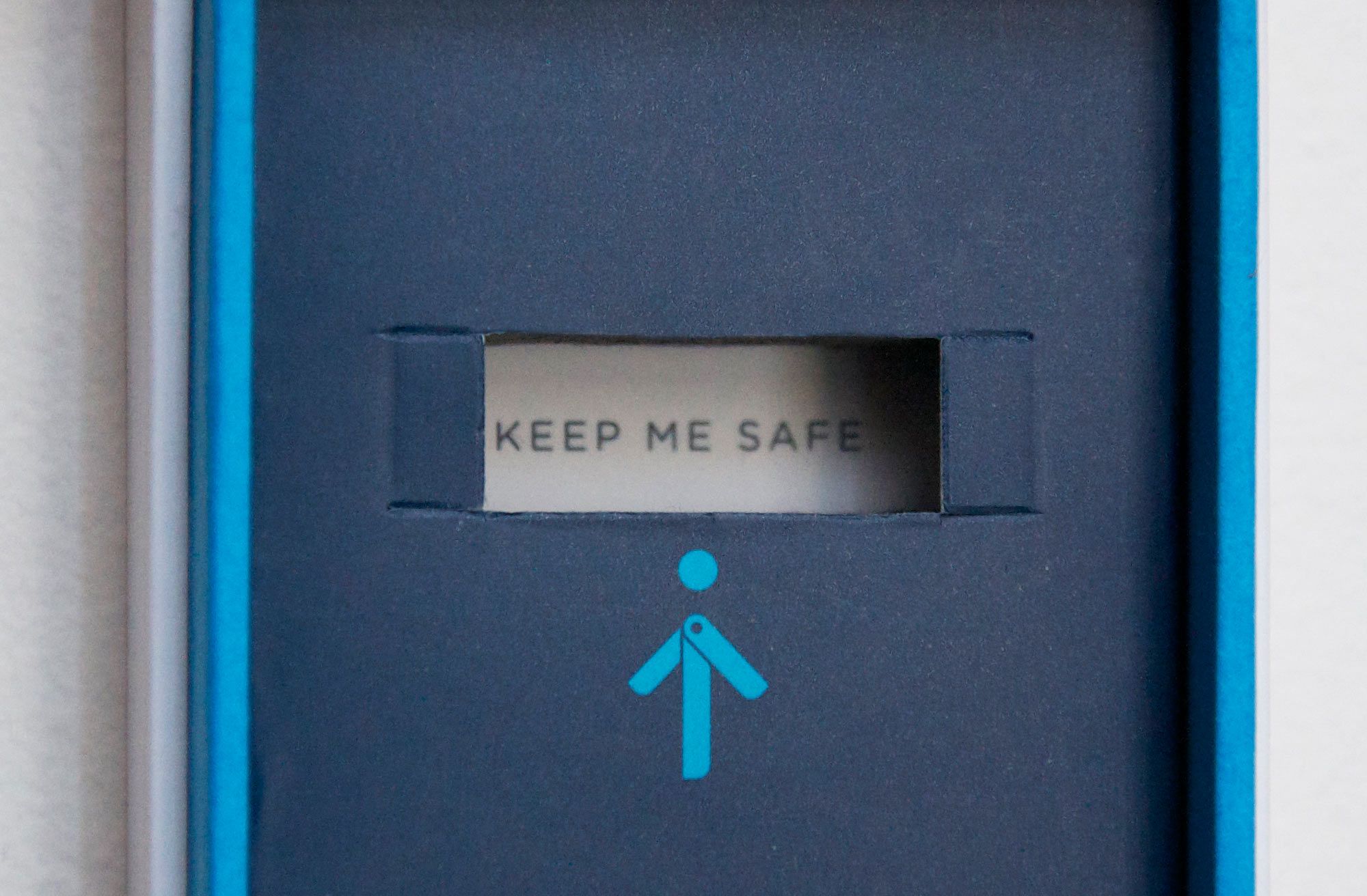
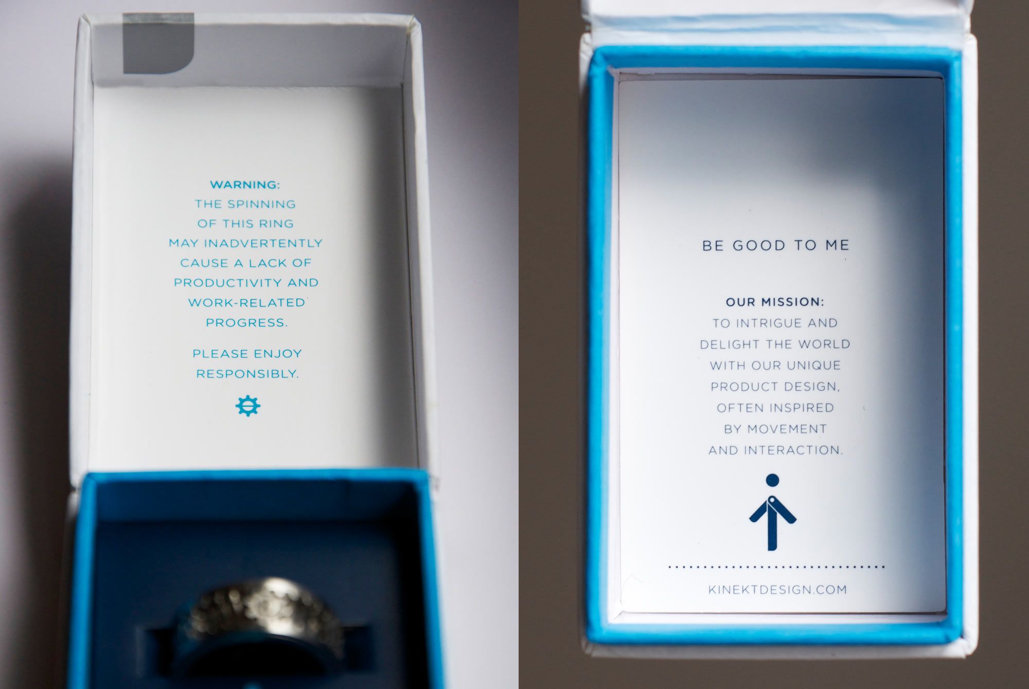
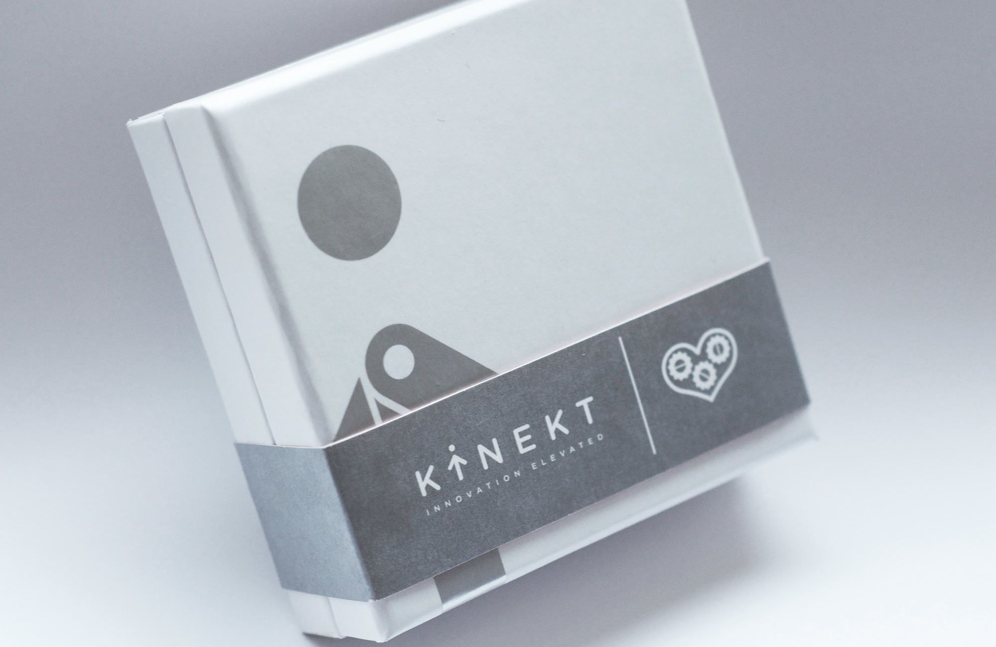
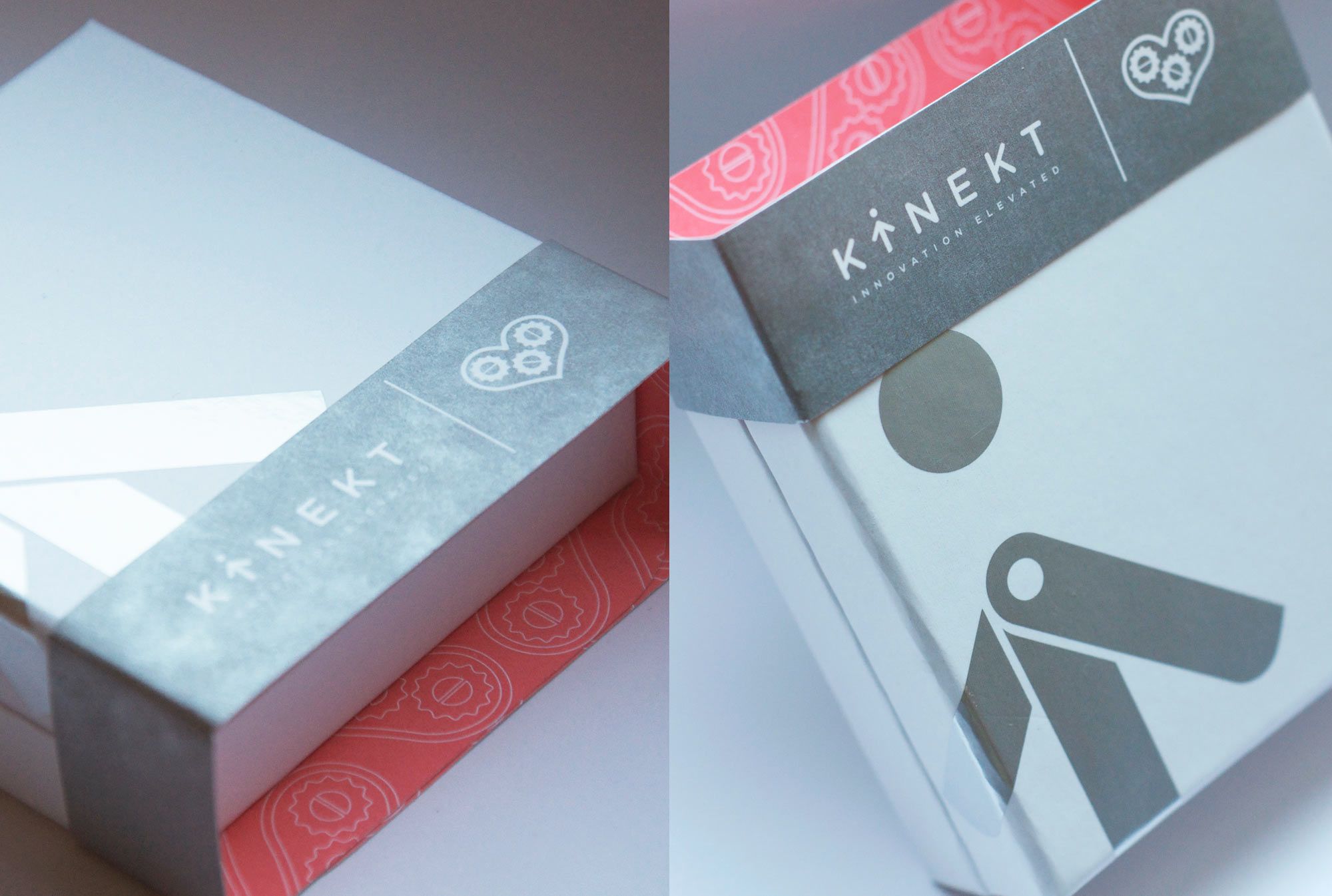
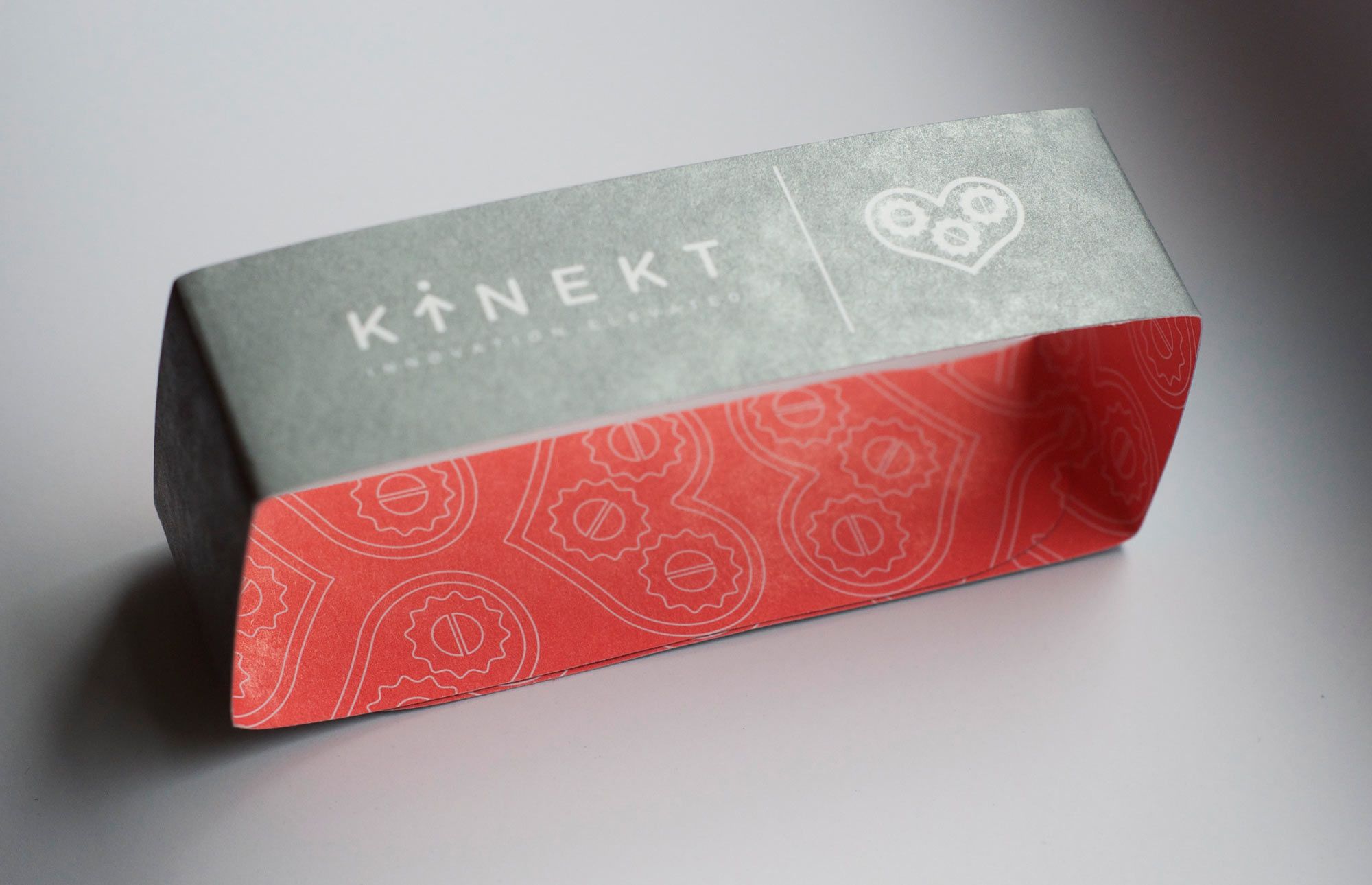
The main branding objective was to match “playfulness” with “sophisticated”. In their own words “Kinket Design seeks to delight and intrigue the world with unique jewelry and product design often inspired by interaction and movement.” Their products are the kinds of things you want to touch, manipulate and talk about. Our approach was to create a logo icon that also looked like it could be touched and moved.The packaging also has several layers of message, meaning and interaction. The outer packaging is very clean, white/silver, which keeps it sophisticated and appropriate for jewelry. Opening the box reveals a splash of color acting as a frame that puts the product in the spot light. Our Kinekt icon cleverly pointing right to it. Once the ring is removed we see a small hidden message reminding you to cherish this fun little piece of wearable design. For the necklace box we sealed the box with a simple belly band with a pop of grapefruit color on the reverse side. A perfect tandem of his/hers gifts. We couldn’t be happier to be momentarily distracted from our productivity due to their ingenious products. Services Performed: Packaging, Illustration, Copywriting, Brand IdentityKINEKT DESIGN
A JEWELRY COMPANY THAT HAS ITS GEARS IN MOTION